Hand Lettering Capital Letters: How To Make Different Styles
We may earn a small commission for purchases made through affiliate links in this post. For more information go to our Privacy Policy.
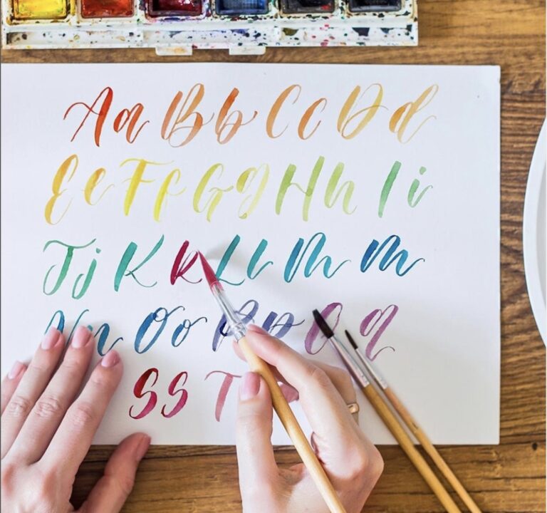
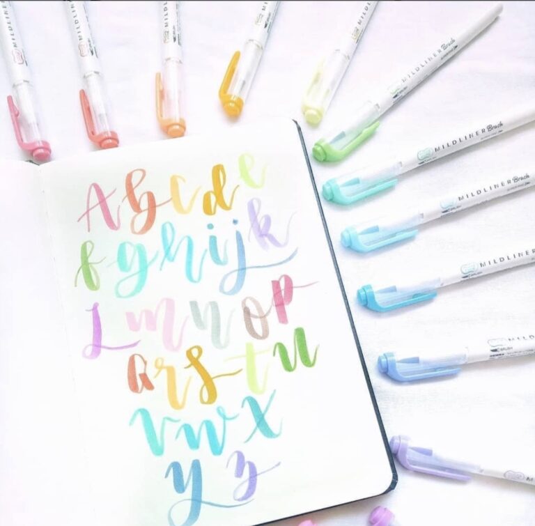
Hand lettering is a fun, creative, and relaxing form of art. However, many people find it to be challenging, particularly when it comes to creating uppercase letters. In this post, I’ll briefly cover the difference between hand lettering and faux calligraphy, and show you over 10 different hand lettering styles that you can use to form your capital letters!

If you’ve been hanging around social media or looking at journaling, scrapbooking, or Cricut design information in the past few years, chances are good that you’ve seen hand lettering.
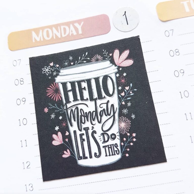
What is hand lettering? It’s an art form involving lettering. Essentially, it takes basic lettering (or writing) and turns it into art by using various thick and thin strokes, decorative strokes, curves, and other embellishments.
The popularity of hand lettering has been taking off like a rocket in the last few years thanks to the explosion in the popularity of journaling, craft, DIY, and digital design.
But while many people find the lower case letters easy (or at least easier) to create, uppercase letters can pose more of a challenge. These larger letters are often more embellished than their lowercase counterparts and are certainly larger to scale.
Plus, there are all kinds of other things to consider, such as if you connect the capital letter to the lowercase ones or not.
Let’s find out and dig into all you need to know about capital letters!
Note: Before we dive in, check out How To Improve Handwriting: 7 Easy Steps to help you feel more confident with your writing before you try taking your skills to another level!
Hand Lettering vs. Faux Calligraphy: Similarities And Differences
Both of these styles are essentially forms of hand lettering because the letters are drawn and edited in multiple strokes instead of being written in single strokes (as they would be in calligraphy).
The main differences between hand lettering and faux calligraphy rest in the styles used for the letters and in how they’re drawn.
For hand lettering, the letters can be drawn in ANY style, from block to cursive to bubble and others.
Faux calligraphy, on the other hand, uses a script style of hand lettering to mimic calligraphy. The letters are drawn, not written. In other words, people draw the basic shapes of the letters with a pen or pencil (so they are actually following a hand lettering process), but then they go back and add weight to certain parts of the letters to imitate how a calligraphy pen would produce the letters.
Thus, it looks like calligraphy, which is where the name comes from. But remember, the difference between these calligraphy and faux calligraphy isn’t how the final product looks but instead rests in the PROCESS of creating the letters.
I frequently choose to use faux calligraphy when I’m hand lettering. At the same time, I have so much fun playing around with different styles of letters when I want to convey a different vibe in my hand lettering.
Hand Lettering Capital Letters In Different Styles
Hand lettering is an art form that encourages creativity. It’s different from calligraphy, which demands the use of a prescribed set of strokes.
With hand lettering, building up the letterforms piece by piece gives you the ability to vary your letterforms any way you want. You can change the:
- Angles of your letters
- Width of your letters
- Shape of your strokes
- Decorative elements of your letters
- And more!
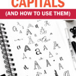
There are SO many ways to style your capital letters! The creative nature of hand lettering makes it possible (and even probable) to develop an endless number of different styles.
And the REALLY appealing part of hand lettering is that you can create fun visual effects with your letters that you can’t do with a calligraphy pen. This includes things like:
- Make letters in fun (or funky!) shapes
- Add texture and dimension
- Create 3D letters
- And so much more…the sky’s the limit!
See what I mean about the endless variety of letter style possibilities? 😉
Process For Hand Lettering Capital Letters
If you’re new to hand lettering, you may be wondering how to go about creating capital letters. The process is different from writing in calligraphy since you are doing more than writing single strokes.
Hand lettering will be a little more time-consuming than writing or calligraphy (if you’ve practiced a lot), but the payoff is that you have the ability to design letters precisely the way you want them.
Here’s a straightforward breakdown of the method for building out your letters when you’re doing hand lettering.
- Draw the basic letter shape – this would just be how you would normally write the letter.
- Add weight or outline the letter – this is where you begin building out your letter by adding weight to the downstrokes or turning your basic shape into a letter outline.
- Adjust your letter to create the style you want – this could involve adding curves, dots, points, or other shapes to your basic letterform.
- Include any final touches – finally, add some shading or other flourishes to give your letters some pizzaz.
I hope this basic step-by-step process for drawing each letter helps you gain an even deeper understanding of the difference between hand lettering and calligraphy.
Now let’s chat about different styles for hand lettering capital letters so that you can use them as inspiration with your lettering or adapt them to create your own unique style.
Styles Of Capital Letters To Try
Now that we’ve covered the differences between hand lettering and faux calligraphy and the basic process for creating letters, I want to share with you some of the different hand lettering styles you can use when making capital letters.
For the sake of space, I’m not going to cover every single style because it just wouldn’t be possible since you can always adjust established styles to create new styles. The possibilities are truly infinite which is what makes this all so much fun!
So instead, I’ll just highlight a few common types of styles that you’re likely to see over and over again. Then once you learn the basics, you can feel free to modify them any way you like.
Sans Serif

This style uses your fundamental letter shapes or block letters. There are no frills, extra lines, or flourishes, and every stroke has the same thickness.
That’s the main reason why a sans serif style of lettering is terrific for beginners to learn and extremely easy to personalize in hundreds of different ways.
Serif

The “sans” in the term sans serif above simply means “without.” So, where sans serif doesn’t have any decorative strokes, serif does. Each letter has small decorative strokes added to the ends of the main strokes.
In addition, different strokes have different weights (or thicknesses). The downstrokes are thick, while the upstrokes and horizontal strokes are thin. Both of these differences give the letters more artistic appeal and (with some creativity) allow for even more customization.
Fancy Serif
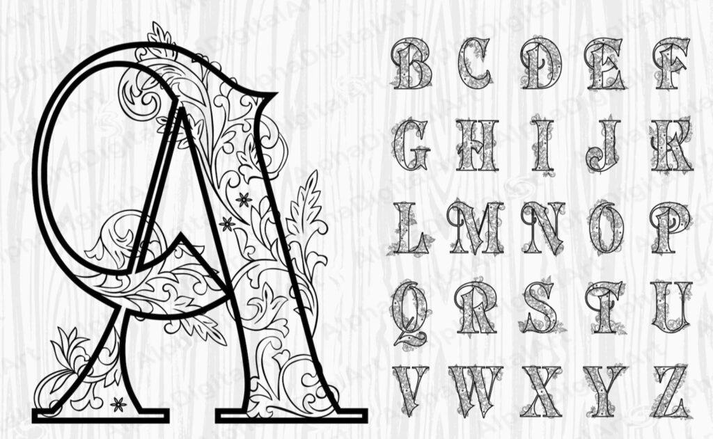
This style takes serif letterforms and adds some extra flair through more pronounced additional decorative details to create elegant letters that are prime for customization.
You can play around with the exact style and change the shape of the strokes. Try thick strokes, triangles, dots, points, flourishes, curly cues, etc.
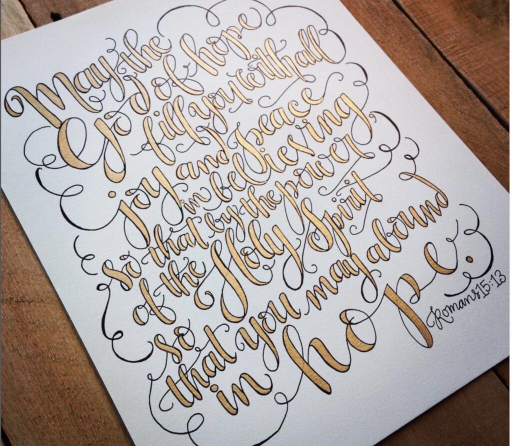
Elaborate
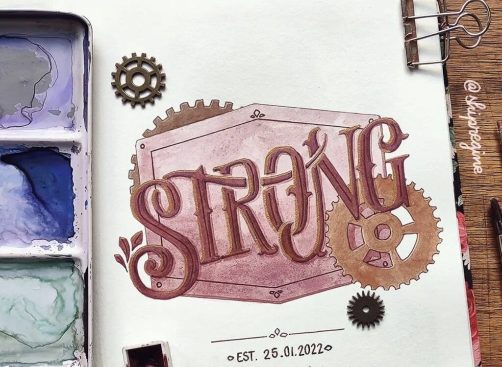
This style of hand lettering takes the fancy serif style and adds some freedom around letter sizing and curvature to create an elaborate style that has more flourish. Your capital letters may connect to the rest of the word or not.
Ornate hand lettering could also include size differences between the capital letters, shading, and other embellishments to adorn the word and take it from basic to WOW!
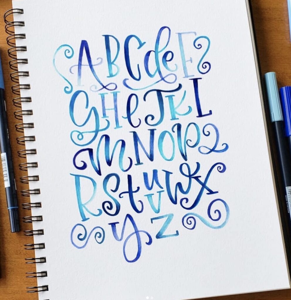
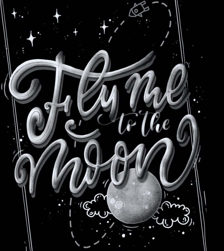
Script
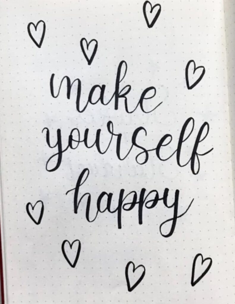
This is your basic cursive faux calligraphy style. The letters connect, the downstrokes have thick lines, and the upstrokes are thin. There may even be some simple swooshes at the ends of letters.
But the number of ways that you can modify or embellish a script style are endless. Let your imagination soar to new heights as you play around with stroke weights, swooshes, swirls, curves, and more!
Swirly
This style uses script lettering and adds swirls to the ends of the letters. The swirls could be basic spirals, or they could be layered loops, or any other design. The more swirls there are, the showier the design will appear.
Note: for this style, you could use letters that have the same weight and just add swirls or use letters that have thick downstrokes.
Shadow

This style works with both your serif-related styles and script styles. It adds dimension and depth to an image to produce a very interesting (almost 3D) effect.
All you do is add a thin line to the side of your downstrokes. You may choose to fill that new section in with shading or leave it open based on your lettering (and desired effect) so that it creates the illusion of a shadow on your lettering.
Blackletter/Gothic
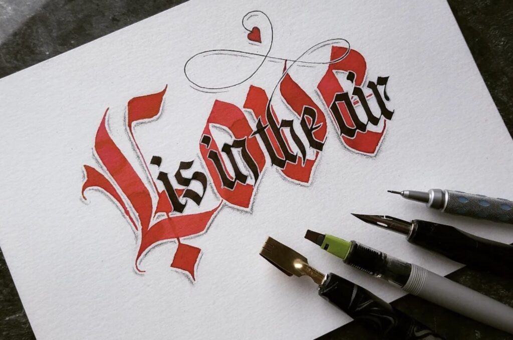
This letter styling has its roots in the calligraphy used in medieval times, as the writing style of the middle ages was very identifiable. Its distinctive characteristics and bold angles (instead of curves) add fun and visually interesting contrast to today’s other lettering styles when you want to convey a certain primitive or throw-back feeling.
Vintage
Instead of going all the way back to the middle ages, how about just going back to the 19th century?
This style can vary a lot and look quite different. But no matter how it looks, there are a few characteristics you’ll see across the board: embellishments and use of color, word shaping, and texture.
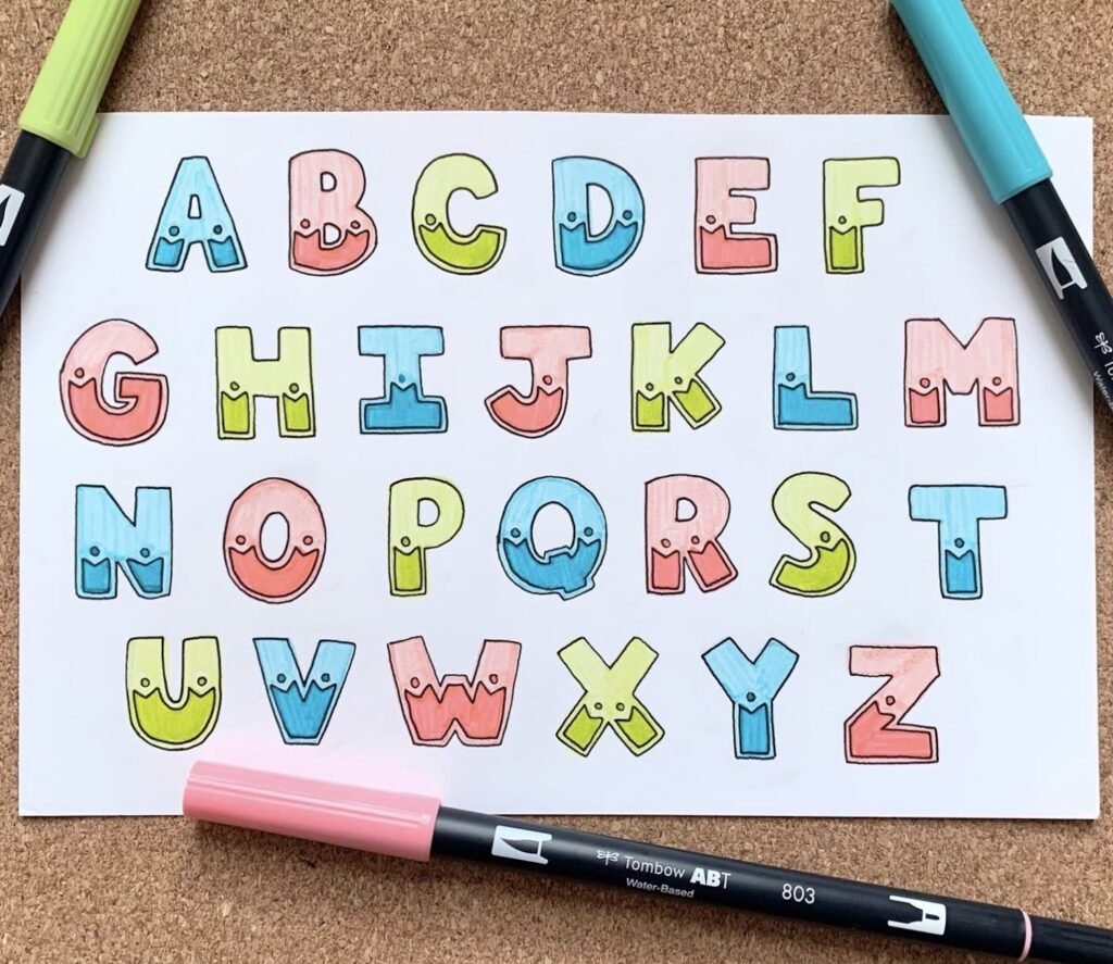
Bubble Letters

Think about the graffiti you see on train cars, underpasses, and buildings. Those large bubble-shaped letters and words in other styles are a form of hand lettering (on a larger surface – and with spray paint!).
Using the same basic process that I outlined above, you can turn your letterforms into curvy, bubble-shaped letters. Then have fun playing around with the outlining, colors, and embellishments.
Tips For Making Capital Letters
Lowercase letters are a little easier to make than capital letters because there isn’t quite as much variation or embellishment. Capital letters can vary wildly from the very simple to elaborate and hit every possibility in between.
Once you get comfortable making lowercase letters, it’s time to practice your uppercase letters! Here are a few tips to help you as you get started.
Do you want to connect capital letters with the word?
Ok, this is a common question I see readers ask, and unfortunately, there really isn’t a simple, straightforward answer.
There are certain letter styles that make connecting capital letters easier than others. And, if I’m being transparent, there are some styles of capital letters that just won’t connect with the rest of the word without looking strange.
And it’s ok if your capitals don’t connect with your lowercase letters! You get to decide what you want your lettering to look like.
If you do want your capital letters to connect to your word, though, I recommend looking for a hand lettering style that will be able to make it work.
Look For Inspiration
A common thing that people do with hand lettering is to develop their own style of lettering. That’s a major part of the fun, I think!
And as you’re learning about lettering lowercase and capital letters, one of the things that really helps is to study how other people make theirs. Other people’s work will be your greatest resource as you learn to letter and work to develop your own style.
Note: don’t just copy their work. You might want to at first so you can learn how to create certain elements. But after some practice, stop trying to mimic theirs and instead take the elements you like and figure out how to incorporate them into your own style.
Instagram, Google, and Pinterest are all great places to find free and plentiful inspiration!
Practice, Practice, Practice
I like to take the old, tired phrase “practice makes perfect” and change it to “practice makes permanent.” Learning to letter is really about building hand-eye coordination and muscle memory.
And the only way to do that is to practice! But the good news is that this is the fun part.
Grab your paper and markers or pens and make it a habit to practice your hand-lettered capital letters every day. Try adding in those differing heights and widths along with any swooshes or swirls your want.
Video Tutorials For Capital Letters
Even with all of the information I have provided about making capital letters, I realize it may not make sense – yet. To give you some concrete lettering examples and more helpful information (visually), I thought it would be helpful to include a couple of videos to check out.
Note: each person takes a slightly different approach to making capital letters and explains it a little differently. If you don’t connect with one video, try another one!
Capital Letters from Scribbling Grace
Scribbling Grace always has great tutorials! In this one, she shares a couple of different capital letter styles that you could practice and then modify any way you want!
How To Write The Capital Alphabet from Loveleigh Loops
The Loveleigh twins go through the entire alphabet with two more styles of capital letters, so you can see how to create even more embellishment.
Uppercase Alphabet In Modern Calligraphy from How To Hand Letter
If you love the faux calligraphy style, this video is for you. She has developed a simple but beautiful style that anyone can learn with just a little bit of practice.
I hope these videos help make the process of learning hand lettering capital letters manageable and make practice fun!
Hand Lettering Styles For Capital Letters: Final Thoughts
Hand lettering is simply an art form of drawing letters by starting basic and adding onto the base to make them more elaborate.
Once you determine how you want to learn how to create letters, you can evaluate which lettering style you want to use. I recommend starting with lowercase letters because they usually have less variation. Then, move on to learning styles of capital letters.
I shared 10 different hand lettering styles, ranging from basic to ornate, to give you an idea of the impact that a little creativity can have on creating a new and unique style.
If you’re new to hand lettering, remember that the process of finding your style and gaining confidence in your lettering takes time and practice. But if you stick with it, you’ll soon create something beautiful and uniquely yours!
I wish you endless hours of enjoyment in learning and tinkering with your style of hand lettering capital letters!