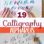
19 Calligraphy Alphabet Examples For All Your Projects
We may earn a small commission for purchases made through affiliate links in this post. For more information go to our Privacy Policy.
Learning to write in calligraphy is both challenging and rewarding. With so many different alphabet calligraphy fonts and styles, it’s hard to know where to begin. Here’s my ultimate guide to calligraphy alphabet styles, including examples and tips to help guide you as you go.
Using calligraphy on your scrapbook pages and in your handmade cards is a great way to add titles, sentiments, or blocks of journaling. Handlettering and scrapbooking go hand in hand. Handlettering and cardmaking do too!
If you love beautiful lettering, learning calligraphy is a must. Although hand-lettering is fun and creates gorgeous lettering, it actually involves drawing letters as art. On the other hand, calligraphy is a style of writing that produces beautiful lettering through a series of continuous strokes.

[convertkit form=6293303]
But, if you’re brand new to the art of calligraphy, it’s hard to know where to start. In this ultimate guide, I’m starting from the beginning with letter families and basic vocabulary, then moving on to types of strokes and how to create variations so you can create a style that’s uniquely yours.
Finally, I’ll go over calligraphy alphabet styles you can create by hand and some alphabet calligraphy fonts you can use in your digital creations to inspire you to improve upon and expand your skills.
Some Calligraphy Basics
It may not seem obvious at first (it didn’t to me, either), but there is an almost infinite number of ways to vary the alphabet letters. Depending on the look you want to achieve, variations may be more noticeable or elaborate than others.
When it comes to learning calligraphy, most people think they need to learn and follow some established alphabet style. While that might have been the standard practice centuries ago, that’s not even remotely the case now!
In the last few years, there has been a massive shift (dare I say, a “revolution?”) in the way people approach the art of lettering. The overall focus of this change has centered around creativity.
Hundreds of years ago, when scribes were the primary users of calligraphy, they learned established calligraphy styles and stuck to following the rules for those styles. Now, calligraphers are encouraged to start by learning established calligraphy alphabets and then adapt them to create their own unique style.
This change has made the art of calligraphy more enjoyable, and it’s created an explosion in interest and creativity. Now, people who never gave learning calligraphy a second thought are learning it, developing personalized alphabets, and teaching others to do it too!
If you love the beautiful lettering of calligraphy, this is exciting stuff because something that was once unapproachable to most people is now easily accessible to everyone – and enjoyed by all.
However, to understand the art of forming calligraphy alphabets in any style, we first need to cover a few basics.
Lettering Distinctions Terms To Know
So that we’re all on the same page, I think it’s necessary to differentiate the types of lettering that many people (especially beginners) use interchangeably. However, these terms have important distinctions that I need to clarify.
NOTE: I cover the difference between hand lettering and calligraphy in more detail in another post. If you want to learn more, please read Hand Lettering Alphabet Practice 101.
- Hand Lettering – This is the art of drawing letters. It involves starting with the basic letterform and adding strokes, erasing parts, or editing the letters as much as you like until you love how it looks.
- Calligraphy – This is the art of writing letters by hand using strokes. There’s no erasing or editing the forms.
- Typography – This is the use of letters that type designers have pre-designed. These calligraphy alphabets are digital and meant for use in all your digital designs. A typography-style family of fonts is called a typeface (ex: Times New Roman, italic, bold, etc.)
- Font – Fonts are specific lettering styles. The term often refers to typefaces but can apply to written forms too.
- Alphabet – An alphabet is a set of characters (or letters) created with a specific font.
[convertkit form=6293303]
Calligraphy Lettering vs. Cursive Lettering
In addition to the terms above, there are a couple of other words that many people mistakenly use interchangeably. Although calligraphy and cursive have some similarities, there are some distinct differences that I need to cover quickly.
I go over these differences in more depth in All About Cursive Lettering if you want to learn more, but here’s a quick rundown for the purposes of this post.
Both calligraphy and cursive are forms of writing art that can look similar to one another, but the method for creating each style is different.
Cursive is written with one continuous stroke without lifting the pen from the paper until the word is complete. Calligraphy, on the other hand, is a series of connected strokes.
Another difference is that cursive is written using any type of writing instrument, and the letters are usually monoline (all strokes have the same thickness). In contrast, calligraphy uses special writing instruments to help create fluid variations between thick strokes and thin strokes.
Instead of learning letterforms, the process of learning calligraphy involves learning strokes and how the strokes fit together to create letters and words.
Calligraphy Alphabet Strokes You’ll Use
When you decide to learn calligraphy, the best way to learn is to start practicing the different strokes. Then, practice putting them together to make them appear as one fluid stroke.
This consistent stroke formation gives calligraphy its neat and uniform appearance, even with the addition of varying stroke thicknesses. Without learning the various strokes first, you’ll find it hard to be consistent with your lettering and to enjoy the look of your final product.
These are the strokes you’ll use in calligraphy:
- Upstroke – Move the pen tip from the bottom left to the top right with a slight curve, using minimal pressure to create a thin stroke.
- Downstroke – Move the pen from the top down to the bottom of the stroke with heavy pressure, creating a thick stroke.
- Overturn stroke – This is a combination of a thin upstroke and a thick downstroke and looks similar to an upside-down “u.”
- Underturn stroke – This is the opposite of an overturn stroke and looks similar to a “u” with a thick downstroke connecting to a thin upstroke.
- Compound curve – This stroke combines the overturn and the underturn to create three parallel lines and two curves.
- Oval – The oval is tricky and will take some practice. Start with a slight upstroke on the right side, and make your way to the top before curving to create a downstroke. Then round into another upstroke to meet up at the starting point.
- Ascending loop – For this stroke, start in the middle with a light upstroke that curves into a downstroke. Maintain the same angle, so your starting point connects to your downstroke but doesn’t cross it.
- Descending loop – This is the opposite of an ascending loop. Begin with a thick downstroke that curves into an upstroke and meets the downstroke at the middle.
[convertkit form=6293303]
Basic Lettering Terms To Know
Before we go any further, there are some terms that anyone who talks about lettering and calligraphy will use. Knowing these common terms will allow you to discuss calligraphy with anyone who shares your interest.
Here are some of the standard terms and their definition:
- Baseline – This is the main writing line on which all letters rest.
- X-height – You may also hear the term “waistline” to mean the same thing. This is the upper height where most lowercase letters (such as “x”) reach.
- Ascender – This is the upper part of the lowercase letters that rise above the “x” height and reach the ascending line (the upper writing guideline).
- Descender – This is the part of a lowercase letter that drops below the baseline and reaches the descender line.
- Counter – This is the circle or oval-shaped space that letters form (open or closed).
- Stroke – Straight or curved lines that form letters.
- Terminal – These are the ends of strokes where you would find serifs (extra small strokes) on the letter.
- Ligature – This is the connecting stroke that joins two letters together in a word. You may also occasionally see the term “joins” to mean the same thing.
- Hand – This term refers to the calligraphic style, such as Gothic hand, etc.
- Interspace – This is the space between letters in a word.
Families Of Letters
If you have some idea of how many fonts exist, it may be hard to know which ones are related to each other and which ones aren’t.
There are three primary families of letters, and all of the fonts available fall into one of these classifications. Knowing the differences between the families can help you understand more about styles as you work to learn calligraphy and maybe even develop your own style.
Let’s go over the families and any basic styles that fall within the same family of letters.
Serif
Technically, a serif is a small stroke attached to the terminals of a letter. More broadly, it’s the family of letters that have serifs. Serifs have endless stylistic possibilities, but the family is usually divided into four groups for easier classification.
- Old Style – This style dates way back and features little discernable difference between thick and thin lines.
- Transitional – This style was popular for a few decades as (the name implies) calligraphy transitioned from “old style” to “modern.”
- Modern – Also known as “Didone,” this style features significant contrast between thick and thin lines with thin serifs.
- Slab Serif – This style was designed to be attention-grabbing and can often be challenging to read. The thick and thin lines display very little difference, but the serifs are very thick.
Sans Serif
This family of fonts presents very clean letters that lack serifs. The word “sans” means “without,” so the name “sans serif” translates as “without serifs.”
Sans serif letters often also feature less stroke width variation than serif letterforms have.
Script
This lettering style is prevalent and features letters that are connected to each other. It can range from simple to very elegant and feminine. Cursive is a member of this writing family.
How To Create Calligraphy Alphabet Letter Variation
You can create variation by changing which letter family you are using. However, each family of letters contains many (possibly infinite) members, and no two members are alike.
So, how do you create variation between fonts in the same family? Here are a few common ways to do that:
Spacing
Spacing is the distance between letters, which allows for letter identification. Variations in spacing can change how writing looks and how easy or difficult it is to read.
Slant
Letters either sit upright or slant to the side, and the angle of slanting can vary. Lettering that tilts to the right side is often called “italic.”
Weight
This term refers to the thickness of the strokes, and letters with more weight have thicker strokes. Letter weight impacts letter-spacing because stroke thickness affects how much white space exists between letters.
Contrast
Contrast refers to the difference between the thick and thin strokes. Some letters have very little contrast, so all the strokes are the same (or close to the same) thickness. Many script styles have great contrast between thick and thin strokes.
Adornments
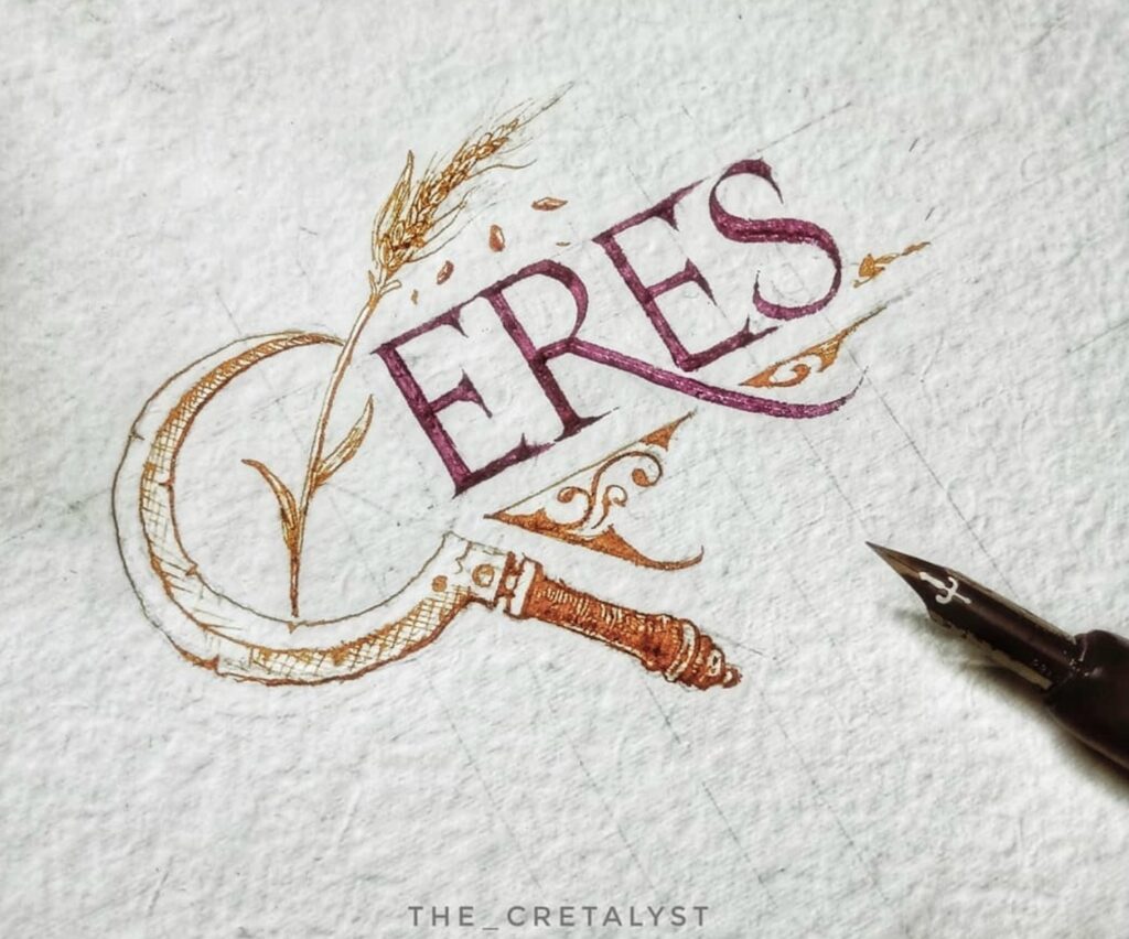
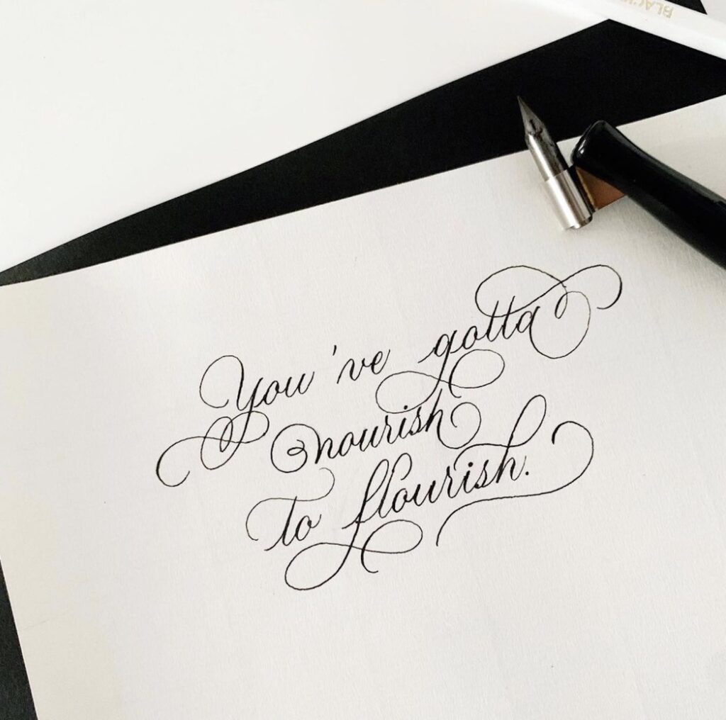
These essentially encompass anything else you can do to letters to add style. Examples include flourishes, swashes, curls, dot shapes, images, or other embellishments.
Remember that while embellishments are a lot of fun to design and add, they can considerably impact how easy your letters (and words) are to read.
What kind of pens do you need for calligraphy?
Unlike hand lettering, which can use any pen or pencil, calligraphy requires special writing instruments to create strokes that vary in thickness. The good news is that you can find some very affordable options. But, like anything else, you get what you pay for.
Here are a few of my favorites calligraphy pens. If you’re anything like me, you may find that you want at least a couple of different options!
Kuretake ZIG Calligraphy Pen
This pen features dual tips so that you have a narrow tip and a broad tip, which makes it easier to write beautiful strokes and create great stroke differences.
Tombow Fudenosuke Brush Pen
Tombow brand pens are one of the most popular brands of calligraphy pens. This one works well for beginners through intermediate-level writers and creates beautiful strokes.
Sakura Pigma Calligrapher Pen
This pen is almost like getting a set of pens in one item. It includes multiple edges of varying widths so that you can choose the best one for your project. The broader the tip you use, the more stroke variation you’ll achieve.
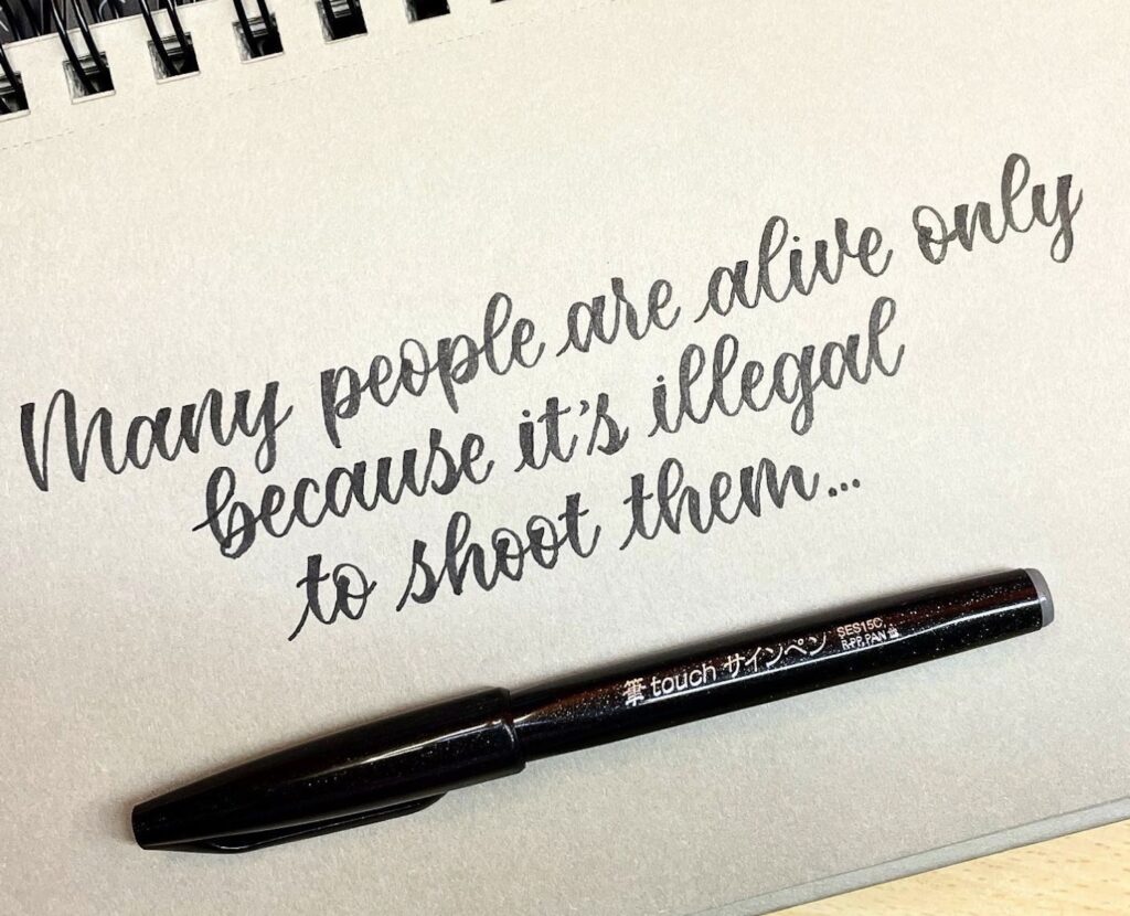
Pentel Fude Touch Sign Pen
If you prefer a pen that effortlessly glides across the paper, this pen is a terrific option. It has a narrow tip and writes those smooth strokes that every calligrapher longs to make!
Hethrone Wooden Dip Pen Set
If you’re a little more practiced and want to create an experience that takes you back in time, this pen and ink set might be what you’re looking for. You’ll dip nibs of varying widths into ink before writing, making this a great gift idea for yourself or another calligrapher in your life.
[convertkit form=6293303]
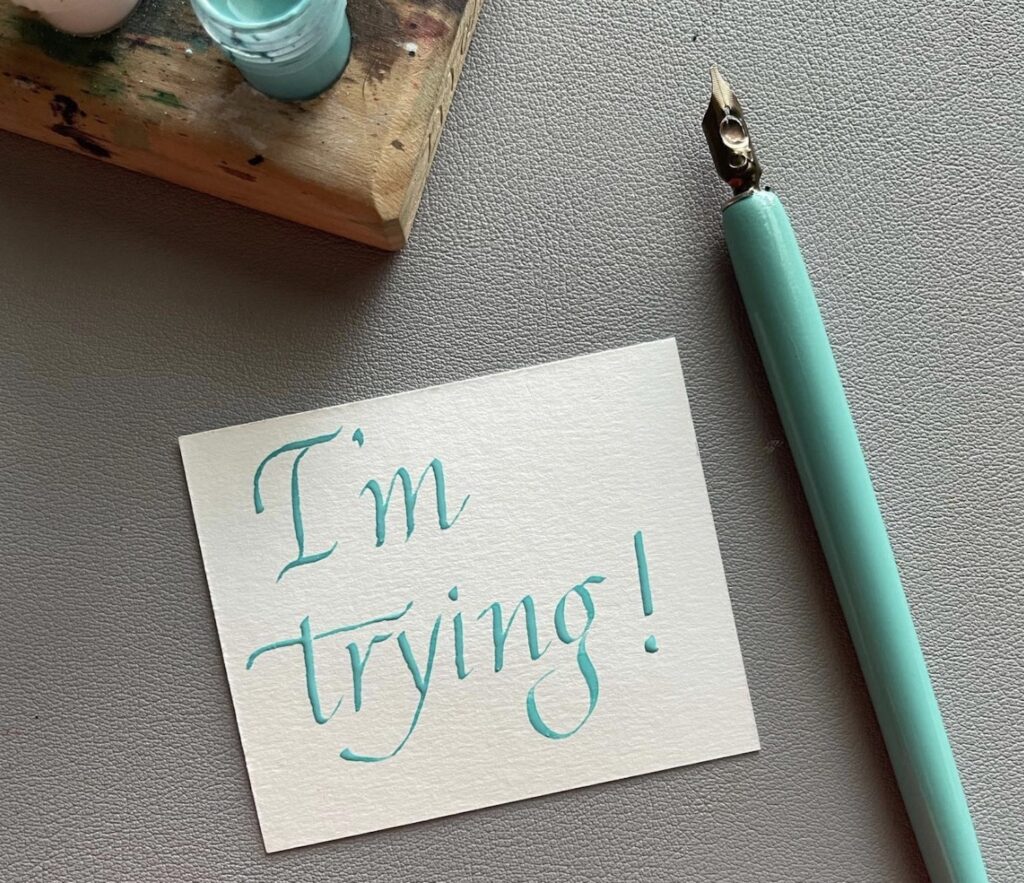
Tips For Calligraphy Alphabet Practice To Improve Your Skills
Here are a few things that “the pros” know about learning how to write the alphabet in calligraphy. Use these tips to help reduce your learning curve.
1. Take Your Time
Learning calligraphy isn’t a race. There’s no prize for learning calligraphy faster than the speed of light! In fact, trying to rush the process is a common mistake many beginners make.
Instead, slow down. It takes time to learn how to do the strokes consistently and transition between bold and thin strokes.
As you practice and gain confidence, your speed will naturally increase.
2. Lift The Pen After Every Stroke
You may see conflicting information about how often to lift your pen. Some people will recommend lifting it off the paper after each stroke. Others recommend only lifting it once you reach the end of your word.
If you’re a beginner, I recommend getting into the habit of lifting your pen after each stroke. This will help you be intentional about practice and build muscle memory so you can adequately space your letters and join strokes.
As I was learning calligraphy, I tended to lift my pen after each stroke when I was new to the art. Once I became more familiar and comfortable, I could connect more strokes without lifting my pen and get consistent lettering.
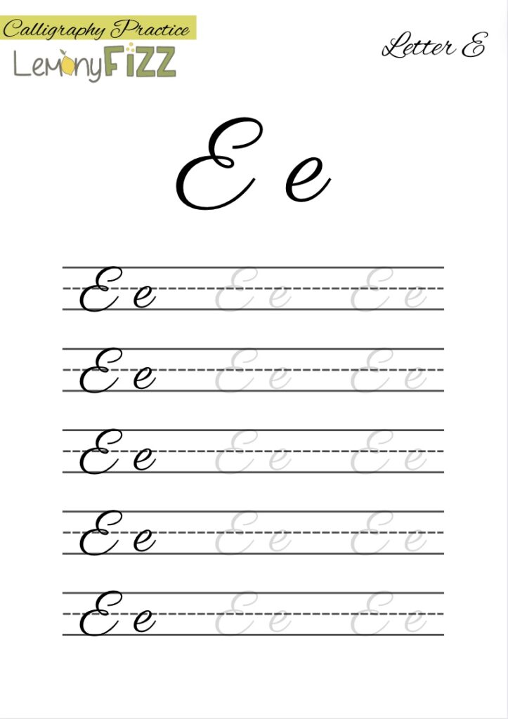
3. It’s Okay To Trace
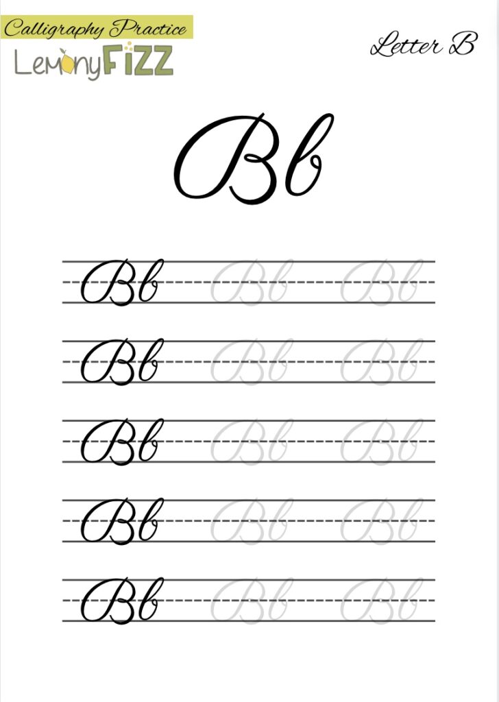
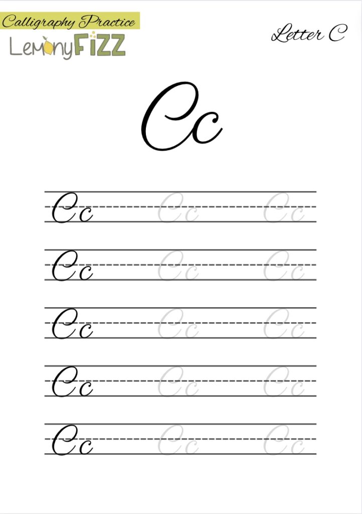
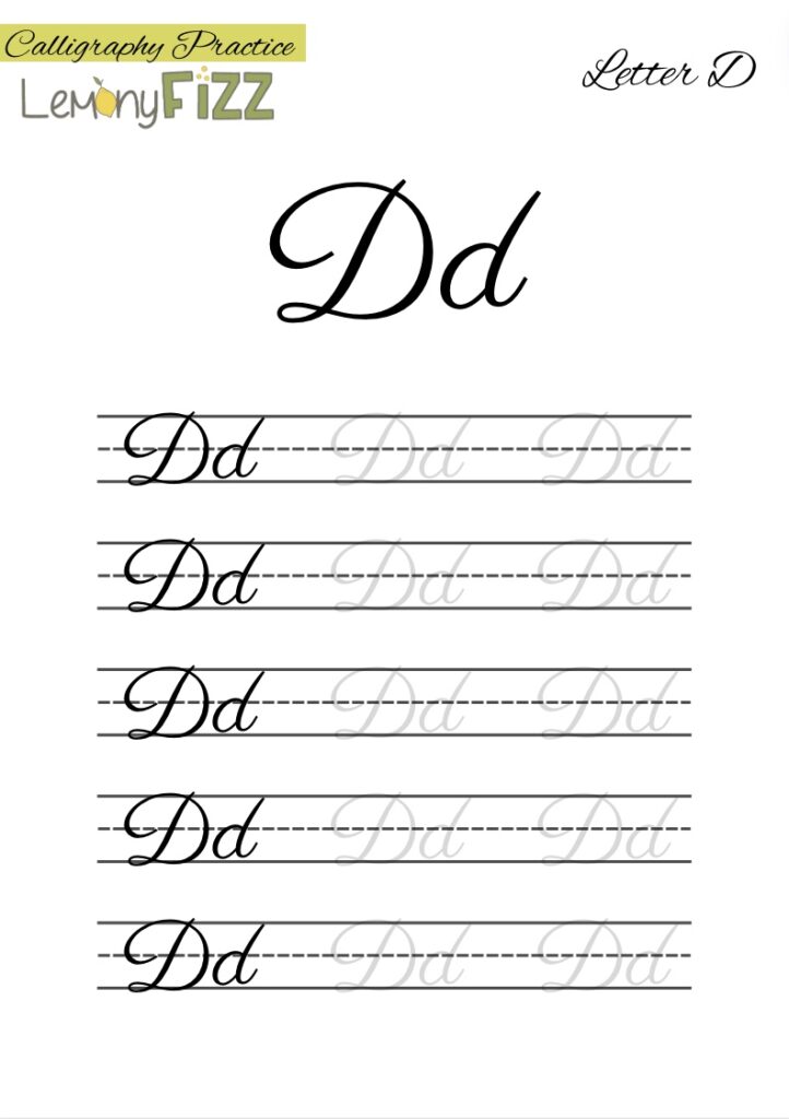
I think calligraphy alphabet practice sheets that you can trace are a beneficial tool! They take out the guesswork of learning a new style and help you gain confidence and build muscle memory.
4. Practice Often
There’s no other way to say it: in order to get better, you have to practice! Try to do a little bit each day, and before you know it, you’ll make huge improvements. Regular practice is the only thing that will help you improve your techniques.
Enjoy the process because calligraphy is fun!
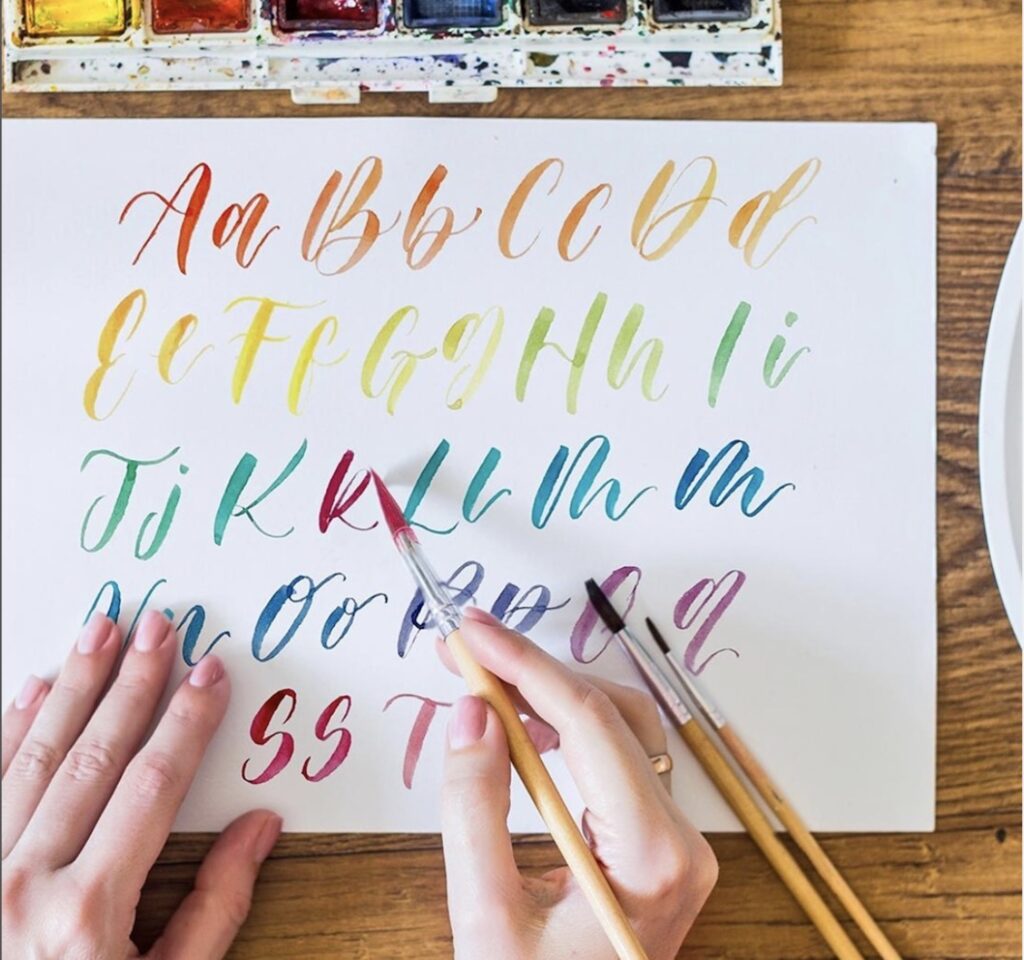
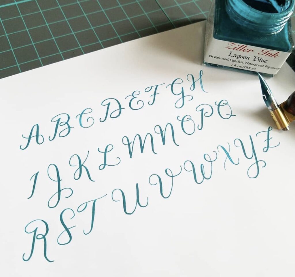
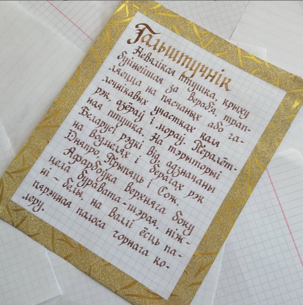
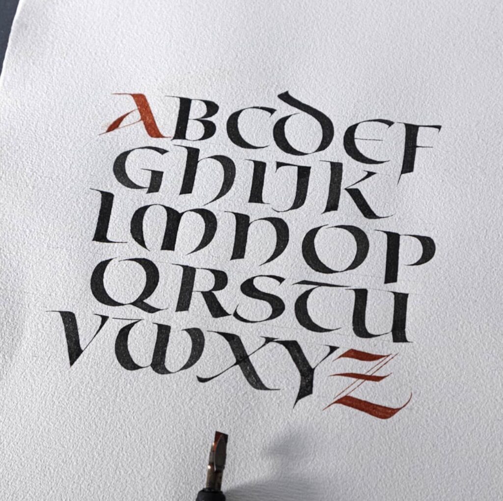
Calligraphy Styles You Can Learn
There are tons of different styles of alphabet calligraphy hands that you can learn (far too many to cover here)! Even though I can’t cover them all, here are a few common ones that you’ll likely see repeatedly.
Roman Rustic Capitals Calligraphy Alphabet
This font is probably the oldest on this list. It uses only capital letters and models the stone-chiseled letters you can still see in ancient Roman monuments.
The letters aren’t uniform, but that’s part of the appeal. This calligraphy alphabet is easy to learn and provides a unique visual impact with an antique vibe to your work.
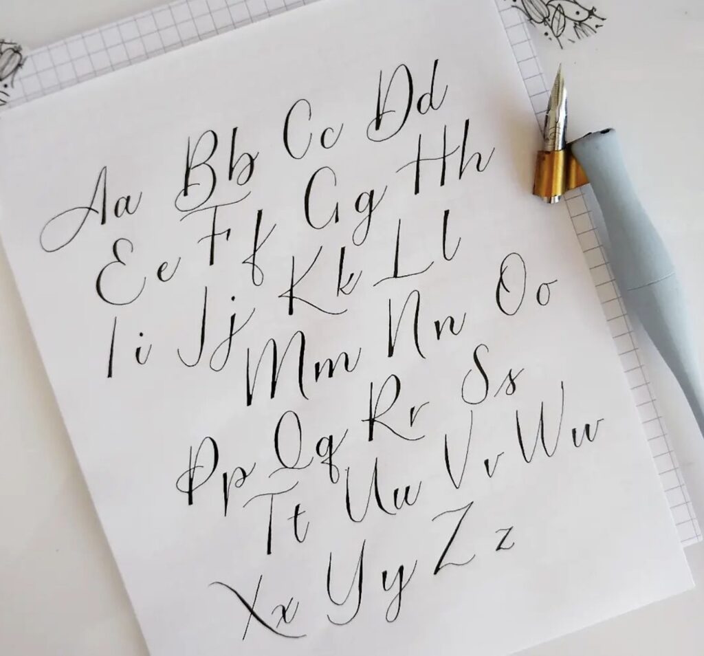
Foundational Calligraphy Alphabet
This style is usually one of the first alphabets people learn when they begin calligraphy. It’s a simple style with only a few flourishes, so it’s easy to read but still looks elegant.
I highly recommend learning the Foundational font first because it’s a great versatile font that works well almost anywhere and provides a solid foundation (ha!) for learning more fonts.
Italic Calligraphy Alphabet
This beautiful slanting calligraphy style also goes by the name “Chancery.” It’s so often used for invitations, poems, and more that it’s the style most people think of when they hear the word “calligraphy.”
If you are eager to learn a new calligraphy alphabet, I highly recommend the Chancery Italic hand!
Uncial Calligraphy Alphabet
This style was widely used by Greek and Latin scribes from the 4th to the 8th centuries. Its use continued in copies of the Bible until around the 10th century.
At first, it was a simple hand, but then gradually began incorporating aspects of the Greek alphabet as it added more flourishes over time.
Uncial is easy to read but takes quite a bit of space, so calligraphers usually only use it in short quotes, titles, or poems.
Copperplate Calligraphy Alphabet Font
You can’t go wrong with the Copperplate font when you want a thin, delicate-looking style. Its grand flourishes make it harder to read than other styles, such as Italic font. But it’s perfect for special projects that people don’t need to read quickly and will likely preserve.
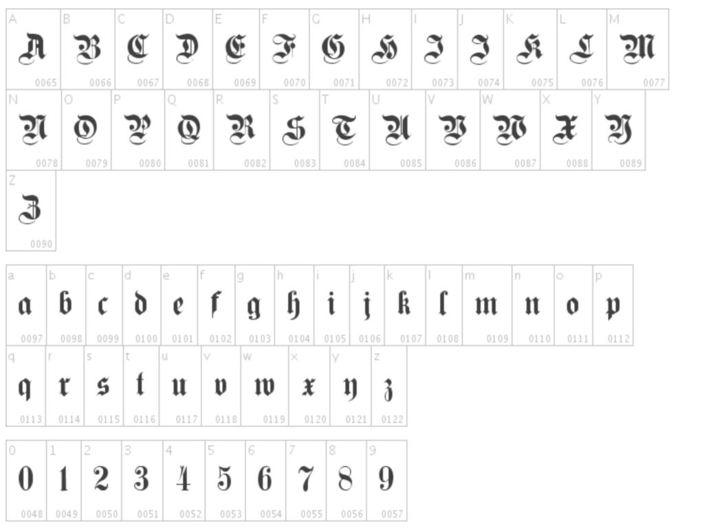
Gothic Alphabet Calligraphy
Also called “Blackletter Script,” this calligraphy style dates back to the 12th century and was the choice script of book production for centuries in medieval Europe. It utilizes chunky letters formed using lots of angles instead of curves.
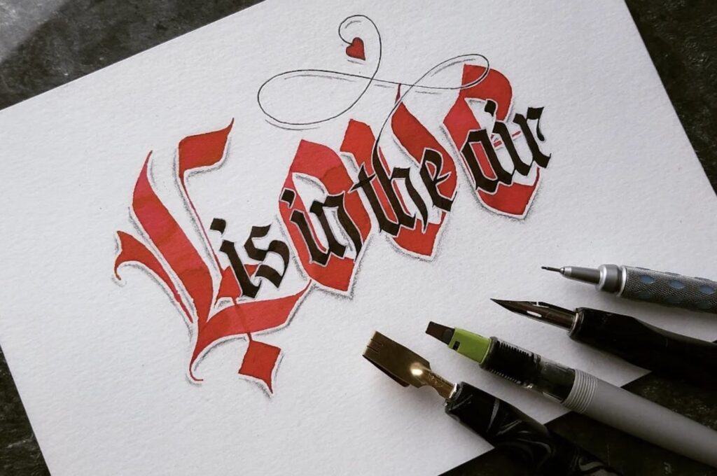
Gothic calligraphy is more difficult to read than other styles, but it works well for limited applications. It’s particularly fitting for a project where you want to impart an antique look, but it’s not a style I would recommend for everyday tasks. Save it for special projects!
Fancy Alphabet Calligraphy
If you love fancy flourishes, then this style is for you! Complete with thin swooshes and flourishes attached to bold, dark lettering, Fancy calligraphy is just as elegant but easier to read than Copperplate style calligraphy.
NOTE: the capital letters are where the “fancy” rests, as the lowercase letters are relatively simple in comparison.
Modern Alphabet Calligraphy Font
Modern calligraphy is today’s dominant form of calligraphy. It follows calligraphy’s basic rules but permits much more letterform experimentation, such as allowing users to add their own flourishes and special touches.
Alphabet Calligraphy Fonts For Your Digital Projects
Writing calligraphy is way too much fun not to do. However, there may be times when you need to print something faster than you can do it by hand. Or you may want to use a calligraphy font or two for your digital projects.
In that case, here are a few must-have versatile digital calligraphy alphabets:
Octavina Script Calligraphy Typeface
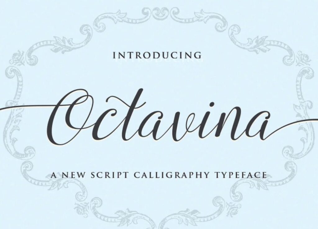
I love this font! It brings to mind the simplicity of Italic calligraphy font with just the right amount of added flourish. You can get the simple version and choose between a few different flourish options to add just the right amount of elegance.
Endestry Modern Calligraphy Font
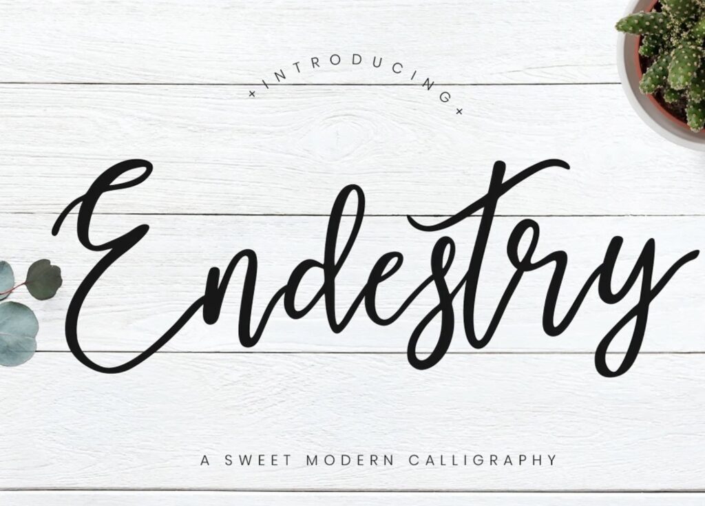
The free Endestry font is a sweet and bouncy modern calligraphy script font that’s perfect for invitations, stationery, weddings, logos, and much more.
This monoline font has just enough flourishes to give your projects a creative handwritten vibe while keeping the letters spaced far enough apart, so it’s still easy to read quickly.
Kingthings Foundation Calligraphy Style

The Kingthings typeface family includes many different fonts. However, the Kingthings Foundation style is an upright modern twist on the Foundational calligraphy alphabet.
It features a combination of rounded lettering with a few angles (reminiscent of Gothic-style) and a few small, delicate curls. This font is very clean and easy to read and will give your project a historical vibe.
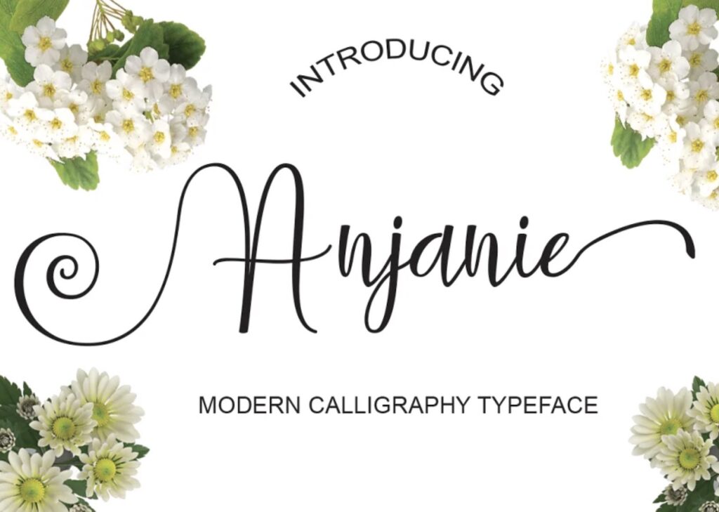
Anjani Script Modern Calligraphy
The Anjani modern calligraphy script has the look of natural handwriting. It features little contrast between the thick and thin strokes and minimal flourishes.
Choose this upright font for advertising, apparel, invitations, and other online projects.
Arabella Script Font
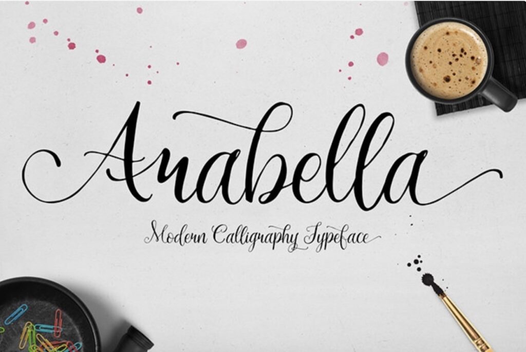
This free font is a script font that features good contrast between thick and thin strokes and just the right amount of flourishes to give a playful feel.
It does feature flourishes, making this font a little harder to read quickly. That’s why it’s best used in small doses for headings, signatures, t-shirts, mugs, etc., or on items that may be preserved, such as wedding invitations.
Salmela Calligraphy Font
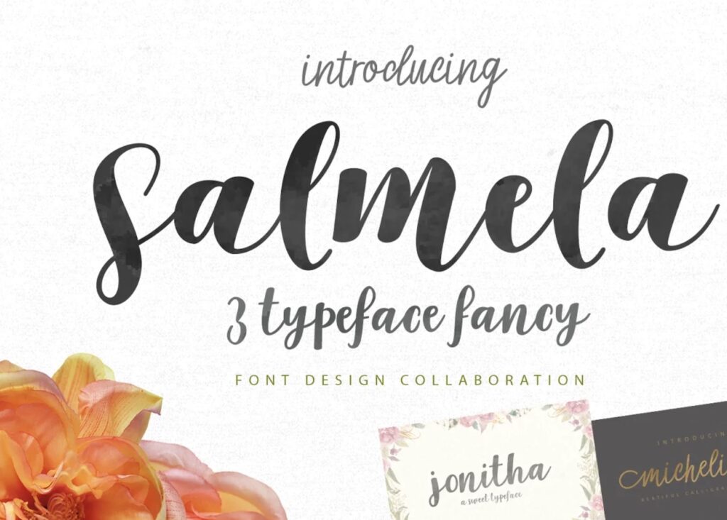
The Salmela font is a lovely modern upright brush font. It features bold lettering with extreme contrast between thick and thin strokes and delicate, thin curls. This font is very versatile, making it perfect for all your project needs.
Allura Font
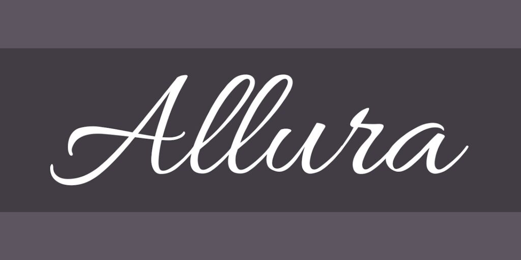
The Allura font is a slanted script font that features minimal contrast between thick and thin strokes. Pulling in elements of the Italic calligraphy alphabet, it projects a clean, elegant, feminine look that makes it easy to read quickly.
It’s a versatile font that’s perfect for stationery, invitations, weddings, and all your other projects too.
Champignon Calligraphy Font
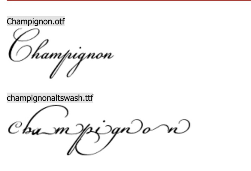
Try Champignon if you’re searching for a classic script font that features old-world charm reminiscent of the Copperplate calligraphy alphabet. It has clean, easy-to-read lowercase letters and elegant capital letters with stylish flourishes and curls.
This font is ideal for formal uses and items that people will want to preserve.
Germanica Calligraphy Alphabet
Germanica is a modern blackletter font that’s great for special projects where you want to impart an old European vibe. It features the bold strokes and angles of blackletter fonts with ultra-thin serifs and swirls to give it antique elegance.
Tangerine Font
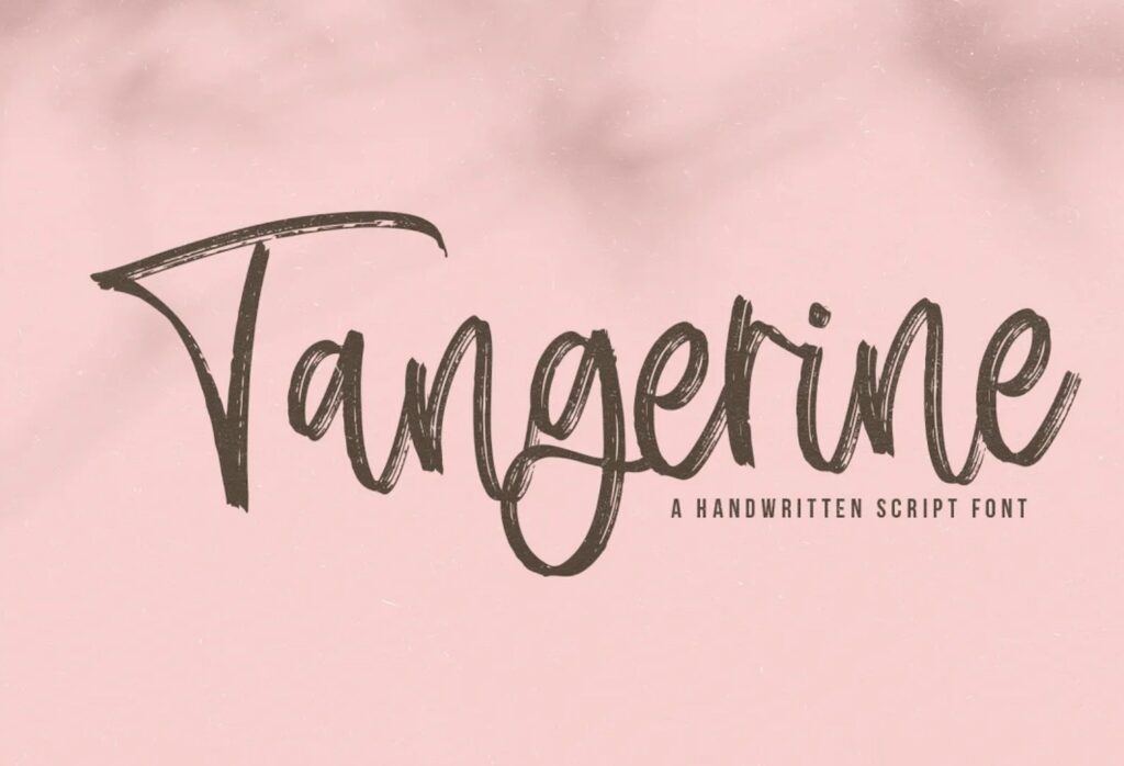
Inspired by handwritten Italic Chancery scripts from the 16th century, Tangerine is elegant and classic. As is typical with this calligraphy alphabet style, it features short lowercase letters. Use it anywhere you want to create a simple but elegant look with a brushstroke appeal.
Brotherhood Script
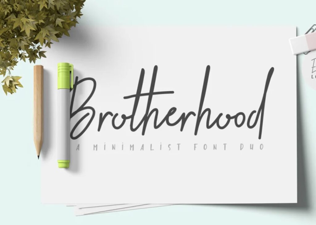
Brotherhood is an elegant font duo that combines beautiful rustic stylish script and caps into one gorgeous package. Brotherhood is a gorgeous typeface for logotype, website header, fashion design, wedding card design, and many more projects.
Creating Your Personal Calligraphy Alphabet Style
After going through some of the most common handwritten calligraphy alphabets as well as some modern version typefaces that you can use in your digital projects, I want to take a moment to encourage you to develop your own style.
Calligraphy may have once been the prescribed style of writing that scribes used to record important events or translate timeless documents.
But the last few decades have seen a vast shift away from working within set styles and moving towards encouraging calligraphers to take elements they like from other styles and create unique calligraphy hands that reflect their personalities.
Final Thoughts About Calligraphy Alphabet Styles
I hope this guide featuring different calligraphy hands has been helpful to you! Beginners may find it easier to learn calligraphy by practicing established calligraphy alphabets such as the Foundational hand or Chancery hand.
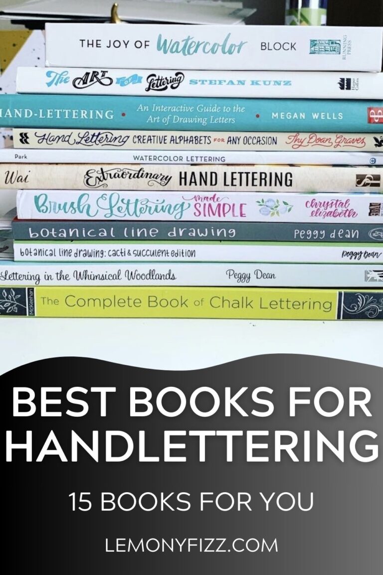
Grab one of these books for calligraphy tips and practice if you need additional resources.
Once your skills improve and confidence increases, you’ll be ready to begin learning other styles of calligraphy.
If you have reached that point in your calligraphy journey, I highly recommend putting some time into developing your own style. Writing calligraphy is fun, but creating your unique calligraphy alphabet is where the magic really happens!
[convertkit form=6293303]
More From Lemony Fizz
- Hand Lettering Alphabet Practice 101: Tips & Resources For Improving Your Skills
- Hand Lettering Capital Letters: How To Make Different Styles
- Best Hand Lettering Books: 15 Must-Haves For Your Library
- How Do You Practice Hand Lettering For Beginners?
- Beautiful Hand Lettered Quotes To Inspire You And Your Lettering