Calligraphy vs Hand Lettering: Everything You Need To Know
We may earn a small commission for purchases made through affiliate links in this post. For more information go to our Privacy Policy.
Hand lettering and calligraphy are both beautiful styles of creating letters, but what’s the difference between them? Today I’m exploring the distinctions between calligraphy vs. hand lettering in depth. I’m covering everything you need to know, from what they are to how to create each style and more, as I answer a few common questions too!
Everywhere you look these days, whether it’s on coffee mugs, t-shirts, or even affirmation cards, there’s bound to be some sort of beautiful writing.
And although many of us think of any script-type of writing as calligraphy, it might not be what you think. You might find yourself looking at a lovely example of hand lettering.
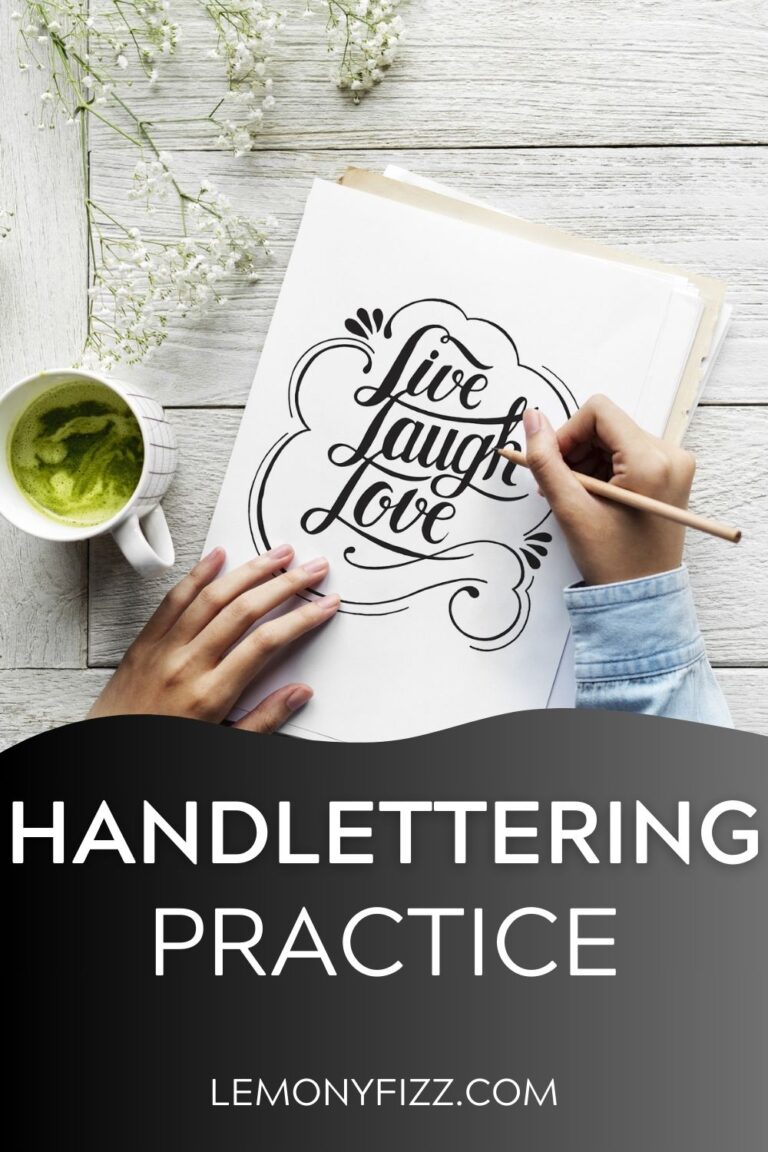
Hand lettering has been taking the creative world by storm over the last few years, and I, for one, couldn’t be happier.
What is calligraphy? What is hand lettering? What’s the difference between calligraphy vs hand lettering?
In this post, I’m examining calligraphy vs hand lettering as I explore the similarities and differences between these two forms of writing in detail. If you’ve been wondering how you can tell the difference between the two, I’m answering that and much more!

What is the difference between calligraphy and hand lettering?
One general area of confusion centers around the difference between calligraphy and hand lettering. It’s easy to feel confused because both are art forms using letters, AND the terms are often used interchangeably.
However, the term calligraphy doesn’t refer to all forms of beautiful lettering.
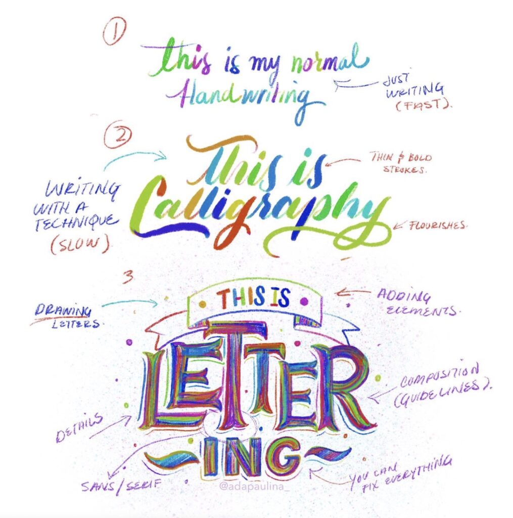
Although both types of lettering involve letters and can sometimes look similar, there are specific distinctions between each one. In fact, the main difference between the two styles centers around HOW the letters are made instead of the final result.
Or, put another way, hand lettering is the art of drawing letters in any style and with any tool. And calligraphy is the art of writing letters (usually in a script style) with special writing tools.
If you’re new to hand lettering, you may not be able to decide at a glance whether you’re looking at hand lettering or calligraphy. To help you hone your skills, let’s take a closer look at the contrast between hand lettering and calligraphy.
What is calligraphy?
Calligraphy is an art form that has been used for thousands of years all over the world. Traditionally, people used calligraphy for writing religious texts, essential documents, poetry, decoration, and more.
The word “calligraphy” is a term that encompasses many styles of scriptwriting. Scribes used brushes and ink to create the swooping shapes we think of as calligraphy today.
What makes calligraphy stand apart from other styles of written art is that it uses varying pressures and specific tools to create broad and narrow strokes as you form letters in a single motion.
You can find a long and prominent history of calligraphy use throughout Persia, China, Japan, other areas of Asia, and the western world.
Each language has its own form of calligraphy. In western cultures, calligraphy employs the Latin alphabet and uses Roman, Italic, and Gothic styles that have been restyled and tweaked into different modern styles and scripts.
These days, people typically refer to calligraphy in one of two ways:
- Traditional calligraphy – the style that has been used for thousands of years, follows a set style, and uses a calligraphy-specific tool, like a pointed nib.
- Modern calligraphy – this is probably the type you see most. It’s usually done with brush pens and includes any script-style writing that doesn’t follow traditional calligraphy rules.
Today, the term “calligraphy” often encompasses both historical styles and modern calligraphic scripts.
How Calligraphy Is Written
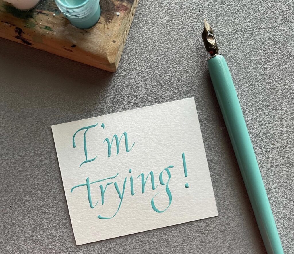
Calligraphy is a form of writing that’s learned through rote practice of various styles. It’s a disciplined practice that requires following a set of rules (which vary, depending on the style you’re writing) to create smooth, fluid strokes.
This writing style is notable for its pattern of thick and thin strokes and specific flourishes that combine to form a unique and beautiful style.
The downstrokes (the strokes where your pen moves from to bottom) are broader and thicker than the thin upstrokes. This imitates the effect of ancient scribes using brushes and ink for writing.
The brush tip would spread out and cause a thicker, heavier line when pressing down for a downstroke. Then the upstroke wouldn’t require as much pressure so that the resulting line would be thin.
Historical calligraphy sticks with one style throughout an entire document, while modern calligraphy may switch between styles.
In calligraphy, the focus is on writing each letter in the appropriate style rather than focusing on the overall composition of the entire piece. If thought is given to composition, it’s usually to consider spacing, the shape of the piece, and planning out any flourishes.
Writing Tools For Calligraphy
To write in calligraphy, you must use a particular writing tool specifically designed to help you create both bold and thin strokes.
Fortunately, there are a variety of tools available to use, including:
- Dip pens
- Nibs
- Brushes or brush pens
- Parallel pens
How do you know which tool to use? The type of script you want to practice will dictate the right tool for the job. For example, a copperplate nib will work well for Spencerian style, but it won’t for Gothic style.
Does calligraphy improve handwriting?
Learning calligraphy won’t necessarily improve your handwriting on its own. Still, it will help you develop more control over your writing skills and help you feel more confident, which could help you improve your handwriting!
What is the difference between calligraphy and modern calligraphy?
Historical calligraphic styles such as Copperplate and Spencerian have been used for centuries, and each style uses a specified series of strokes and formations.
Modern calligraphy is any style of calligraphy that isn’t a traditional style.
Are calligraphy and cursive handwriting the same thing?
This is a common misconception. Handwriting is functional and practical. It’s the style of writing that you use to jot things down every day, so it needs to be quick. On the other hand, calligraphy’s stylized and embellished letters are more art than functional writing.
And with both forms of writing, there’s always room for improvement! Learn how to improve your handwriting.
How can I teach myself calligraphy?
I found it helpful to watch video tutorials at first to get an idea of what to expect and what I needed to know. But I think the best way to learn is to practice and physically try writing it yourself.
After watching just a couple of video tutorials, I was ready to launch myself into working on my skills. At that point, I found practice worksheets helpful, and shortly after that, I was confident enough to work entirely on my own.
So, yes, you can teach yourself calligraphy! While there are tools out there that can help with the process, it’s really a skill you just have to learn independently.
What is hand lettering?
Just by looking at hand lettering, you can tell that it has many things in common with calligraphy. However, it differs in that it’s a form of illustration.
To put it simply, hand lettering involves drawing the letterforms and building up the letter rather than writing the letters in one single motion like you would with calligraphy.
Calligraphy vs. hand lettering…which is older?
While calligraphy has been used for thousands of years, hand-lettering isn’t quite as old. Instead of being employed by scribes and used in historical documents, hand lettering came into existence through modern marketing. People began using it in advertising for logos and on walls, billboards, and signs.
With hand lettering, there are fewer rules to follow regarding creating particular styles. In fact, there’s so much freedom that you can adjust the letters or edit the shapes until you’re happy with them because you aren’t following a set of stylistic rules.
Calligraphy (especially traditional calligraphy) involves following rules for a set style, but that’s not the case with hand lettering. That’s why I love it so much – it allows room for my creativity to flow!
It is important to consider composition with hand lettering because each letter is drawn and then stylized. That may mean the letters are drawn in an outline first and then filled in, or maybe they’re written first and then outlined with pens or markers. No matter how you do it, having an eraser nearby is helpful!
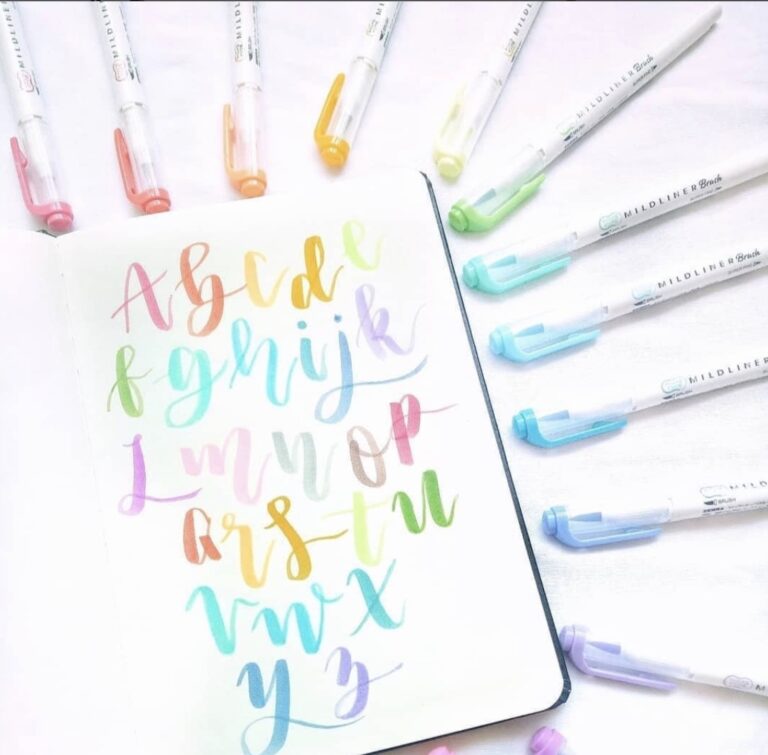
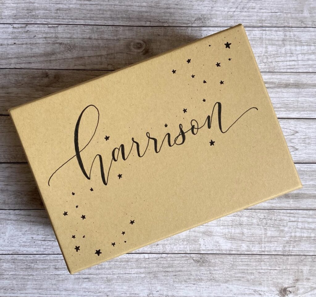
Hand lettering is more versatile than calligraphy because it offers the ability to make your letters unique and design them to illustrate a particular feeling or mood.
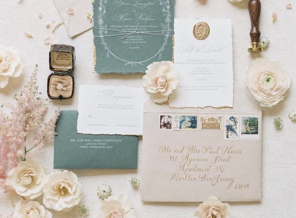
Additionally, it’s ideal for a large variety of project types, including:
- Planners
- Bullet journals
- Greeting cards
- Book covers
- T-shirts
- Homemade signs and canvas art
- Coffee mugs
- Cricut projects
- And more!
How To Hand Letter
The process for creating letters differs significantly between calligraphy vs. hand lettering. While calligraphy focuses on writing letters in single strokes, hand lettering encourages every stroke to be separate. Thus, one letter may be comprised of several strokes.
As a result, calligraphy will flow at a faster rate, while hand lettering will take more time. But the tradeoff is that you have the ability to edit and try different shapes to give your lettering style a unique appearance.
Here’s a basic rundown for how to build your letters when you’re practicing hand lettering.
- Draw the basic letter – in other words, write the letter as you normally would.
- Outline the letter or add weight to downstrokes – this is when you turn your letters into block letters or begin making some strokes wider than others.
- Edit and adjust your letters as desired – this might mean changing the shape of your letters slightly by adding curves or other shapes to them.
- Finalize them – have fun adding a variety of embellishments such as flourishes or shading to give your letters their final look.
After reading through this process, can you see how different calligraphy vs hand lettering is even when they don’t look all that different?
Tools Needed For Hand Lettering
One of my favorite things is that you don’t need any special writing tools to create beautiful hand lettering. Any pencil (except mechanical), pen, marker, crayon, chalk, or brush will work!
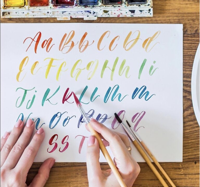
And it’s a perfect art for using mixed media! Feel free to experiment with different tools such as pencils, colored pencils, watercolors, acrylics, gouaches, colored pencils, and anything else you would use for illustrating.
Plus, it doesn’t matter if you’re using broad tips or fine tips because you can create fantastic hand lettering styles with all of them. Simply adjust the type of tip to the style you want to make.
With just some paper and something to write with, anyone, from beginner level to advanced, can practice hand lettering to improve their skills and develop their style.
Calligraphy vs Hand Lettering Styles
In order to help illustrate (pun intended!) the difference between these letter art forms further, I want to point out a few different common styles of lettering for each.
First, I want to mention that there are three basic types of calligraphy, based on which part of the world it originates and the language for which people use it. Those three types are Western, Eastern (also sometimes called Oriental), and Arabic. And within each type of calligraphy, there are many different styles.
I’ll only focus on the Western type since it’s the one that uses Latin letters.
Common Styles Of Calligraphy
Anything that’s been used for thousands of years has plenty of time to shift and change, which certainly applies to traditional calligraphy.
Here are a few styles that you’re likely to run into:
Foundation Style
As one of the most simple and basic calligraphy styles, it’s often the first type people learn when they learn calligraphy. It was the first style I learned!
It still looks elegant with only a few flourishes present, but it’s easy to read and versatile so that you can use it in many different places.
Italic Style
This style is also sometimes known as Chancery and is a simple, slanting style of Western calligraphy that many people use. In fact, it’s so well-known that it’s often what people think of when they think of calligraphy.
Italic style looks elegant and is often used on items such as poems, invitations, and more.
Gothic Style
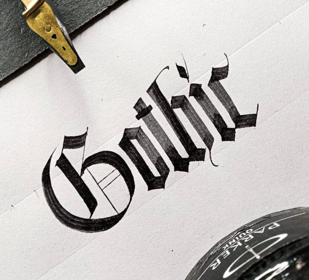
Also known as “Blackletter Script,” this style utilizes chunky letters with many angles instead of curves. Dating from the 12th century, you’ll find this calligraphy style in old manuscripts or important texts.
Not as easy to read as other styles, Blackletter Script isn’t the best option for everyday tasks but works well for wall art or to give an antique vibe to something that the reader doesn’t need to read quickly.
Roman Style
This style is unique because it only uses capital letters that aren’t uniform, which gives them visual appeal. The lack of lowercase letters makes this style less versatile than other styles, but it’s perfect for things where you want to create an antique look.
Copperplate Style
This style is elegant and delicate-looking with thinner lines (due to the use of a pointed nib instead of a flat one) and flowy swooshes.
Since it’s not as easy to read as Foundation style or Italic style, it’s not a great fit for items that people need to read quickly. However, it’s perfect for invitations or other special items that people might want to display or save.
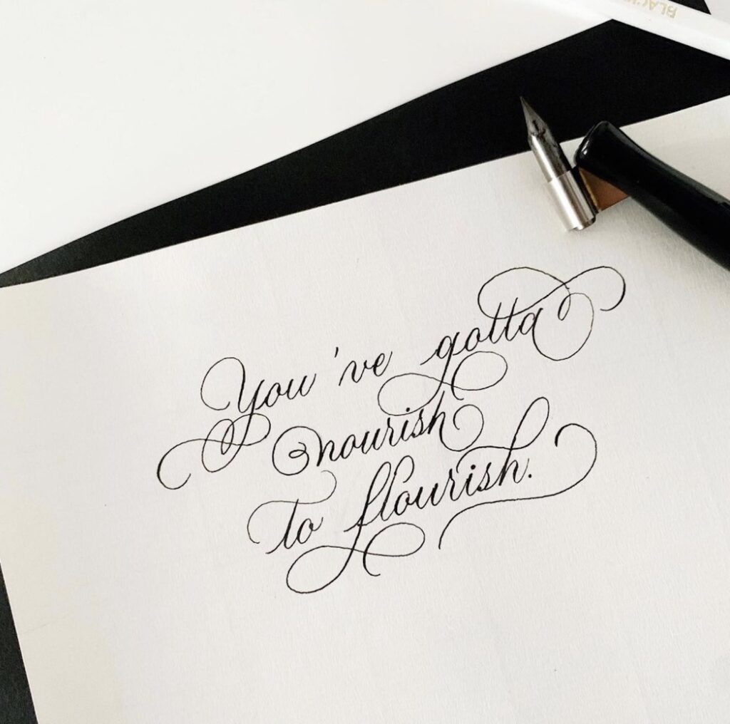
Modern Calligraphy
The term “modern calligraphy” has come to mean any type of calligraphy that isn’t one of the traditional styles. Modern calligraphy follows the basic rules of calligraphy but allows for a little more experimentation, such as allowing users to mix and match letter styles and play with flourishes.
Brush Lettering
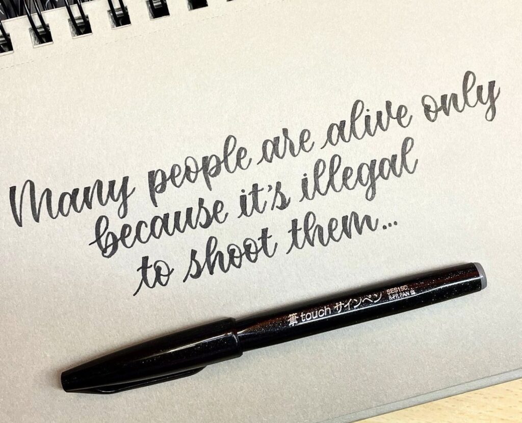
These days, most calligraphers use flexible nibs as their writing tool of choice. However, brush calligraphy (a style of modern calligraphy) uses brush pens, which are traditional in Oriental types of calligraphy, to create angles, curves, and various pressures.
Common Styles Of Hand Lettering
Don’t let the fact that hand lettering hasn’t been around as long lead you to think there are fewer styles! Hand lettering’s lack of strict rules and creative nature drive the nearly constant formation of additional styles.
Here are a few common examples you’ll see:
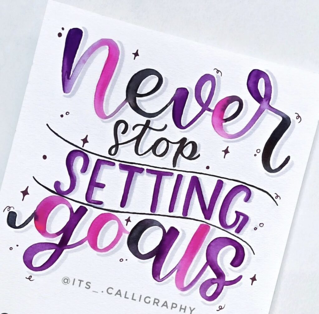
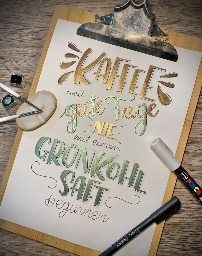
Faux Calligraphy
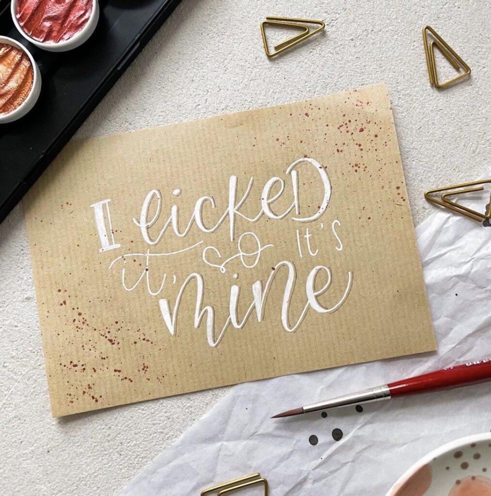
This style really begs the question of whether it’s calligraphy vs. hand lettering!
Also called script font, the cursive style mimics calligraphy because the letters connect, and downstrokes are broad while upstrokes are thin. There may even be some simple swooshes at the ends of letters.
Faux calligraphy blends calligraphy and hand lettering. The style looks like calligraphy, but the letters are drawn, not written. You can use any writing tool you want then go back to each letter to add thickness to the downstrokes, giving them the appearance of calligraphy.
There are no stylistic rules for faux calligraphy, so let your creative side out as you play around with different curves, stroke thicknesses, swirls, and more.
Serif Letters
Serifs are the decorative strokes at the ends of each letter stroke. Plus, downstrokes and upstrokes have different thicknesses, which inherently gives the letterforms more visual appeal and opens the door for customization opportunities.
Fancy serif hand-lettering style adds more flair to serif letters by making the decorative elements more exaggerated and possibly adding flourishes.
Sans Serif Letters
Also known as mono weight, the word “sans” in the name means “without.” Sans serif lettering style uses basic letter shapes and gives the same weight to every stroke without any extra frills.
It’s a fun and easy style that’s perfect for beginners to learn and a breeze to customize. This style’s versatility is unmatched since you can use sans serif lettering for nearly everything.
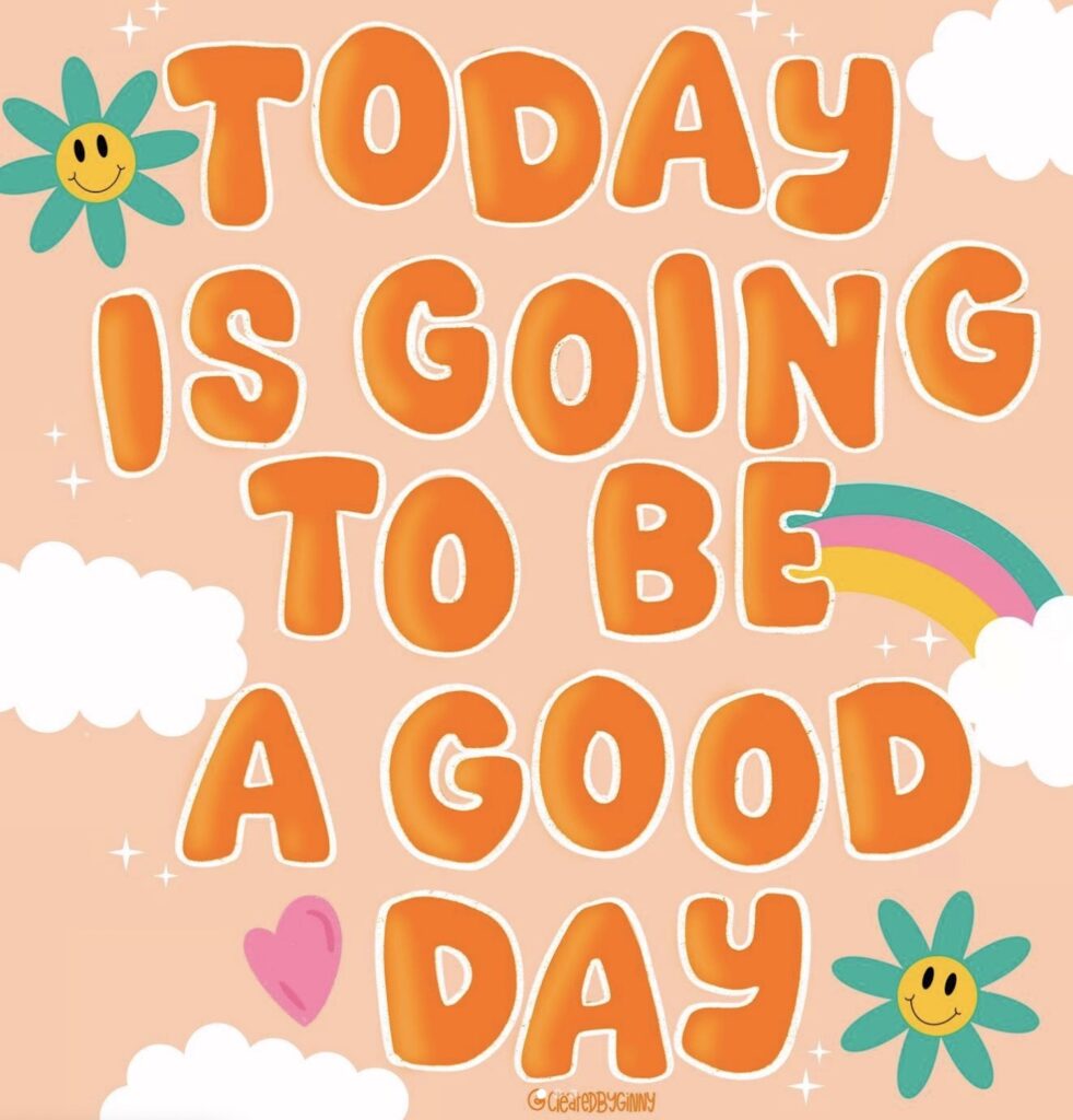
Decorative Letters
Take your basic serif style to new levels by making it bigger and bolder, or by adding special elaborate decorative elements. It opens the door to more creative freedom by allowing you to play around with letter sizing, shading, and the addition of a vast range of embellishments.
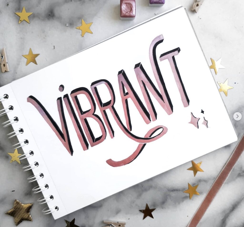
3-D Lettering
This style is easiest to do with serif and sans serif styles, but it can work with script styles too. It’s a way of producing a shadow effect on the letters to add more dimension and depth.
If you want to make this style, you just need to add a thin line alongside your downstrokes. Then shade it or leave it open (based on your design) to create the illusion of shadows.
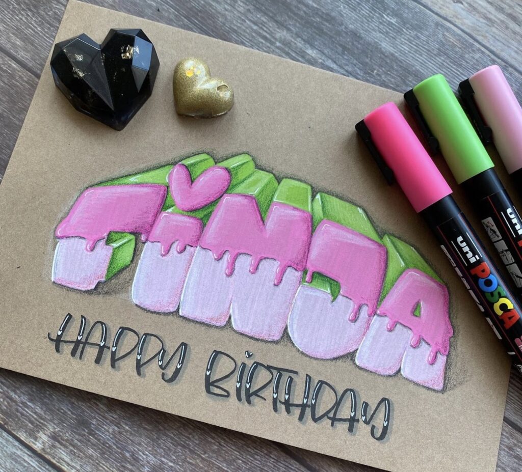
Bubble Lettering
Think about graffiti. The letterforms have added curvature to the strokes to create large bubble-shaped letters that often overlap each other. This style allows a lot of leeway for creativity through playing around with the letter (and word) colors, embellishments, and adding outlines.
Chalk Lettering
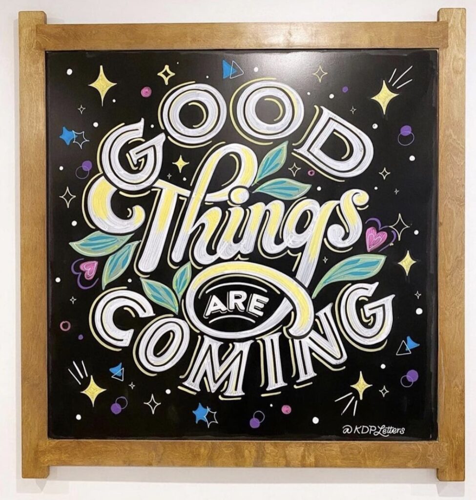
Imagine writing on a chalkboard. This style incorporates different styles such as block letters and script into one. You will often see additional elements such as banners along with fun textures and contrasts in the letters.
Best Writing Tools For Calligraphy vs Hand Lettering
Which pens are best for calligraphy? Which pens should I use for hand lettering?
I gave some general examples of the types of writing tools that work best for calligraphy and hand lettering above. Now I want to share some specific suggestions.
Remember, you can always start basic when learning either hand lettering or calligraphy. Then, if you decide you enjoy the art, consider investing in one (or more) of these tools.
Can you do calligraphy with a regular pen?
When it comes to calligraphy, you need the right tools in order to create beautiful smooth strokes that vary in thickness. You can use normal pencils and pens to practice forming the shape of your letters at first, but if you want to achieve great results, you’ll need the right tools for the job.
There are several options and types of calligraphy pens to choose from, and the chances are good that you’ll want different pens for different projects. Here are a few of my favorites:
Sakura Pigma Calligrapher Pen
This pen comes in a set with varying edge widths, so you can pick which one you want for each project you create. The wider the tip you use, the more definition you’ll have in your letterforms.
Pentel Fude Touch Sign Pen
If you prefer a fine tip, this pen glides across the paper and creates beautiful smooth strokes.
Kuretake ZIG Calligraphy Pen
This pen has dual tips to give you both a narrow and a broad tip option, making it great for beginners. The dye is water-based, so you can create a lovely watercolor effect when you want to.
Tombow Fudenosuke Brush Pen
This brand is one of my favorites for lettering pens, and this pen, in particular, is an excellent option for anyone at any skill level.
Hethrone Wooden Dip Pen Set
If you’ve honed your skills and want a more authentic or time-honored experience, try this set. It has nibs of varying widths that you dip into ink before writing. Enjoy this yourself or give it as a gift to that calligrapher in your life.
What are the best pens for hand lettering?
When it comes to hand lettering, it’s more of a “create it with what you have” scenario! You don’t need any special tools and can even create gorgeous hand lettering with a pencil, a pen, or even a Crayola marker.
If you’ve been practicing and are at the point where you’d like to upgrade to a brush pen, here are the ones I would recommend.
Tombow Fudenosuke Brush Pen
I’m not kidding – this brand really is my favorite for all lettering tasks! This pen has a firm but flexible tip for precision as you draw strokes. They create the look of a brush tip with the control you need for small or intricate lettering.
Pentel Sign Pen Brush
I recommend these pens for beginners because the ink has a smooth flow, the colors are rich, and they create a significant variance in their strokes.
Do you need a special type of paper for calligraphy vs hand lettering?
Every day printer paper is just too thin when doing lettering with ink or markers. If you’re only using pencils, colored pencils, or ballpoint pens, regular paper is probably all you need.
However, if you’re using ink or markers, you’ll need to use thicker paper of higher quality so that it can absorb the ink.
In addition, a paper that’s too smooth can make intentionally forming letters difficult. That’s why I recommend using calligraphy paper like this Strathmore calligraphy pad so that you are lettering on thick paper with just enough texture to help you remain intentional with your strokes.
Calligraphy vs Hand Lettering: Tips To Improve Your Skills
When you learn any new skill, there’s a learning curve you need to go through. Both calligraphy and hand lettering have that same curve, but here are a few tips to help you find success as you take on learning this new skill.
1. Take Your Time And Be Intentional
A common mistake I see repeatedly is that people want to get to the end, so they rush through the process. Learning lettering is an area where the tortoise wins the race.
Slow down and intentionally make your strokes. You’re creating art, and art can’t be rushed!
If it makes you feel better, though, over time, you will become more adept and “sure-footed,” which will make your lettering a little faster too.
2. Hold Your Writing Tool At An Angle
To achieve those gorgeous wide downstrokes and narrow upstrokes, you need to hold your pen at a 45-degree angle. Although this is helpful in all lettering, it’s especially important for any script fonts or calligraphy.
3. Tracing Can Help
I found the best way to learn when I was just starting on my journey was to use lettering practice sheets and trace over letters to build muscle memory. I found that helpful at first because it eliminated frustration so that I quickly became confident enough to practice on my own.
4. Practice, Practice, And Practice Some More
All new skills take time and patience to master. The same is true for calligraphy vs. hand lettering. The only way to improve is to practice as often as you can. Make it a habit so that you do a little bit every day. Practicing regularly will help you develop your skills quickly.
Calligraphy vs Hand Lettering: Final Thoughts
You will likely hear the terms hand lettering and calligraphy (incorrectly) used interchangeably at some point because that has become pretty common.
However, when it comes to calligraphy vs. hand lettering, it’s important to remember that the terms are important because they refer to differences in the lettering process rather than the appearance of the final product.
While hand lettering is drawing letters by starting basic and adding onto the base to make them more elaborate, calligraphy is simply writing letters by following certain rules and using specific tools.
If you’re new to lettering art of any kind, remember that it takes time to learn a new skill and gain confidence. But, if you are intentional about it and make it part of your daily routine, you will soon have a new hobby that you can use in many different ways – or just for fun!
I hope this post was helpful in clearly spelling out the differences between calligraphy vs. hand lettering. While these two forms of lettering art are similar in some ways, they also differ in many aspects. Knowing the difference between the two can help you decide where you’d like to focus your attention and energy as you become familiar and comfortable with lettering.
Finally, once you feel comfortable with your newfound skills, try putting yourself to the test by making these hand-lettered quotes!