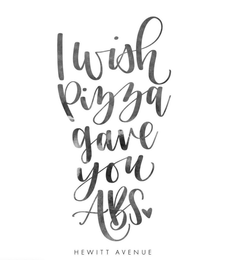
How do you practice hand lettering for beginners?
We may earn a small commission for purchases made through affiliate links in this post. For more information go to our Privacy Policy.
I’ve found that practicing writing each of the letters is a great way to practice hand lettering as a beginner. It can be time-consuming, but the result is worth the time you spend practicing. I recommend practicing one letter at a time by tracing the shape of the letter on paper for as long as you can before switching to another letter.
What is Hand Lettering?
Hand lettering is a form of art that is both time-consuming and rewarding. It takes patience, practice, and the right tools to get good at this craft. If you are looking for a new hobby or artistic outlet, consider hand lettering. This article will cover what it means to be an artist in this field as well as offer some tips on how to start practicing without too much difficulty.
Be warned: there are no shortcuts when it comes to mastering the skill of hand lettering! You’ll need lots of hard work and dedication if you want your letters to look like they came from someone who knew what they were doing. Luckily, we’re here with all the information you need about getting started as a beginner in this beautiful and challenging art form.
Hand lettering is the art of handwriting. The letters are written with a pen or brush. Hand lettering can also be called calligraphy, a modern take on traditional writing.
You don’t need to be ‘born artistic’ to create beautiful hand lettering! You just need to have a drive to be creative and a willingness to learn and practice. Read this ultimate hand lettering guide and get started.

2. Why should I learn hand lettering?
Hand lettering can be a hobby or even a profession if you put in the work and dedication needed to succeed. There are many reasons why people choose to learn how to do hand lettering: it’s an artistic outlet that allows creative expression; it helps keep their minds sharp by exercising different parts of their brain; it’s a way to relax after a stressful day at work or school; and finally, some people like doing hand lettering as a business because they love creating custom pieces for clients who crave unique artwork! It doesn’t matter what reason drives your desire – we’ve got all the information you need to get started in hand lettering below.
3. What can I do with hand lettering?
You can use hand lettering as a hobby, as an art form, or as a way to make some extra money.
Hand lettering is usually done for wedding invitations and announcements, logos and web graphics, logos and print designs for small businesses, or craft projects that need custom text.
Use hand lettering as a way to decorate your home with custom word art, sell your finished products, or dress up your social media feeds with custom quotes that are hand lettered.
4. Can anyone learn hand lettering?
Hand lettering is a skill that anyone can learn if they are willing to put in the time and practice.
The challenge comes when it comes to mastering hand lettering, but there are no shortcuts when it comes to getting good at this art form, so be prepared for lots of hard work!
There are many reasons why people learn hand lettering – some do it for fun or for artistic expression, while others do it as a business opportunity. It doesn’t matter what drives your desire to learn hand lettering.
5. What do I need to get started with hand lettering?
There are a few tools that you will need to get started as a hand lettering beginner. The good news is, they are relatively inexpensive and easy to get. You might even have them already laying around your place or in your office supply stash.
The Supplies and Lettering Tools
- pencils and pens
- paper
- ruler
- eraser
Choose Your Pens & Pencils
When you’re just starting out with hand lettering, likely the first set of supplies you’ll need to get is a package of pencils and some pens. You can go with whatever color or type of pen/pencil you prefer so long as it suits your needs. The only rule is that the pencils should be lead – no pigment!
I recommend buying some thicker leaded pencils for practicing because they are easier to grip and use at first. I also recommend using an HB Pencil if you don’t have any experience drawing because this will produce light lines – perfect for beginners.
- Nicpro 0.5 mm Mechanical Pencils Set- Drafting pencil lead works with mechanical pencil with no need to sharpen, very convenient. Ideals for artists, professionals, teachers and students alike. Perfect for writing, draft, drawing, sketch.
- Mitsubishi Uni Kuru Toga High Grade Mechanical Pencil 0.5 mm Lead – good for practicing
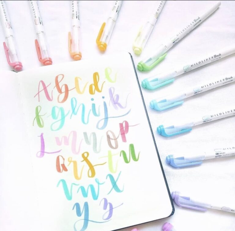
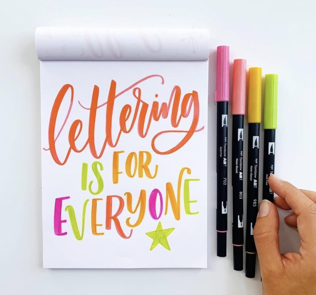
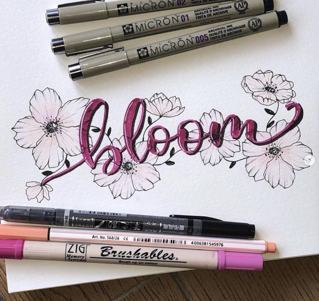
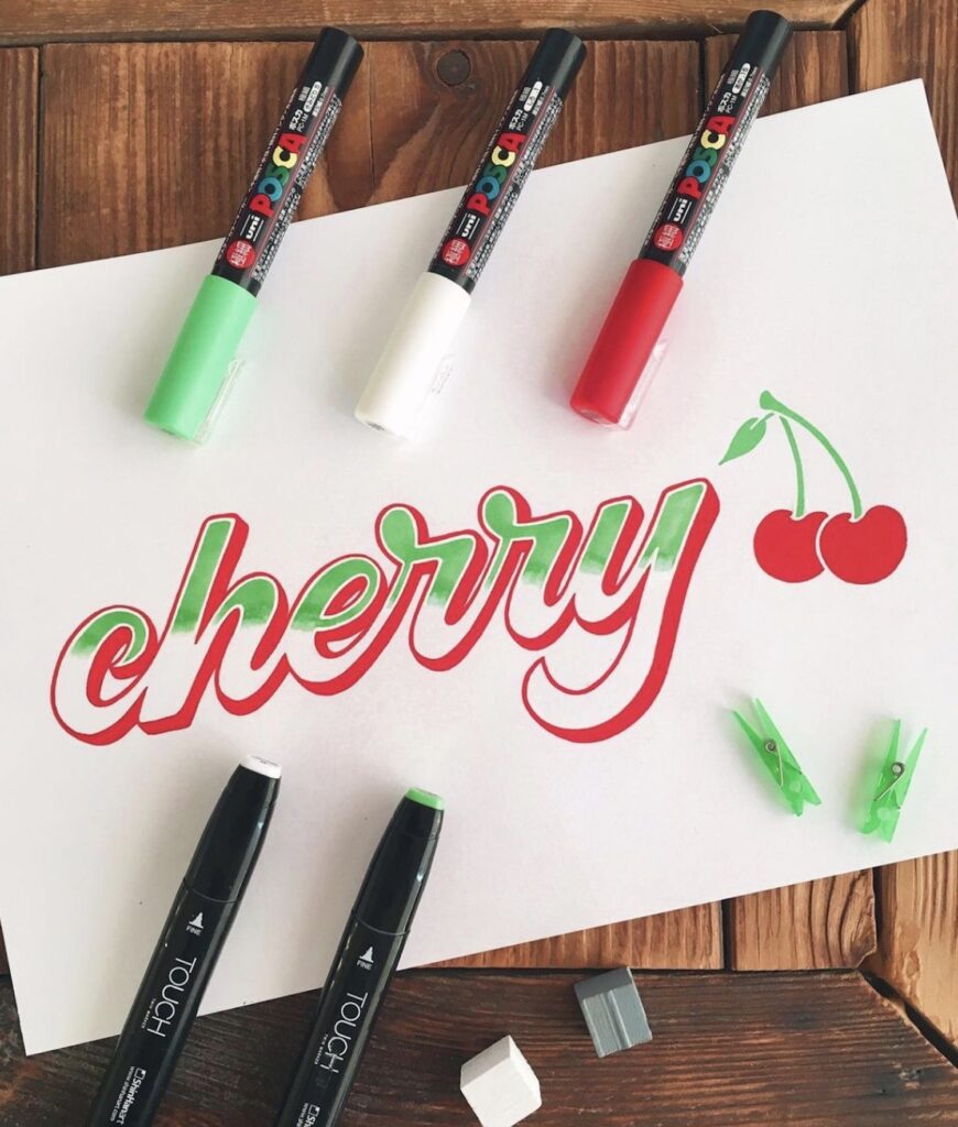
- Tombow Dual Brush Pens 97 – these bright water-based inks are my favorite for hand lettering. They come in a vast array of gorgeous colors and work great on any type of paper so you can color or letter however your heart desires!
- Tombow Fudenosuke Twin Brush Pens – great all-purpose pens perfect for hand lettering or coloring. The tip is split into two parts so it gives you the option to write thin lines or thicker ones depending on where you travel along the surface of your paper.
- Copic Fineliners – my favorite for adding the finishing touches to my work.
- Faber-Castell Pitt Artist Pens – they’re lightfast and waterproof.
- Kuretake Fudegokochi Brush Pens – these pens are easy to squeeze so you can achieve a nice thick/thin line depending on your writing pressure.
- Staedtler Triplus Fineliners – the color is highly pigmented and rich, with a smooth flow of ink for clean, crisp lines.
Choose Your Paper
Your paper choice can affect how your hand lettering ends up looking! Hand lettering on different kinds of paper will be completely different, so experiment with different types to see what you like best. Here are some options to choose from:
- Kraft Printer Paper – A stylish collection of patterned kraft paper that’s perfect for creating invitations and announcements.
- Southworth Linen Cotton – This simple cotton is great for writing on if you’re just beginning to explore the world of hand lettering. It’s sturdy enough to provide a nice surface but doesn’t feel harsh or scratchy against the skin.
- Canson Mi-Teintes Pastel Marker Pad – If you’re just practicing and experimenting, this paper is perfect to use because it has a beautiful color variation. If you’re not happy with your work, you can simply tear out the page and start again!
- Strathmore Bristol Smooth Paper Pad – A popular favorite for sure. It’s sturdy but still provides great flexibility so that you can easily move your lettering around if needed.
- Strathmore Mixed Media Drawing Pad – If you like to use pencils and pens, this is the paper for you! It’s great for any type of medium because it provides the necessary flexibility across all types of media.
Extra Hand Lettering Supplies
Ruler – take the time to find a ruler that you love. Not only will it keep your lines straight, but it’s also perfect for positioning your paper just right so you have plenty of room to work. You can also use rulers to measure spacing between letters and words once you get more familiar with hand lettering!
The eraser – You’ll need this for making clean, neat marks. Also works great to create straight lines if you use the edge of your eraser as a ruler!
Blending Stumps – these are useful when transitioning between light and dark areas so you can “smooth out” any harsh or uneven edges.
How Do You Hand Letter For Beginners?
There are different ways to do hand lettering. You can do it by outlining your letters and coloring them in, coloring your letters without outlines, having half of your hand-drawn letters inked and not inked, and many more!
You don’t need to limit yourself to one technique! Mix and match your way to lettering greatness. Hand lettering beginners might be overwhelmed by all the resources, ideas, and polished pieces they see. Don’t let this slow you down. Everyone has started at the beginning. Comparison will steal your joy. Find what you love and then work to be good at it.
1. Get Inspired!
Look at examples of lettering and try to understand what makes them so unique and interesting. Look for different fonts and styles and test drive the ones that really speak to you!
I find that I often get inspired by watching my favorite shows on Netflix, reading fashion magazines in bed, listening to music in my room, and checking out places on Pinterest or Tumblr that I’ve pinned for later inspiration.
However you get inspired, let the ideas flow, and go with it!
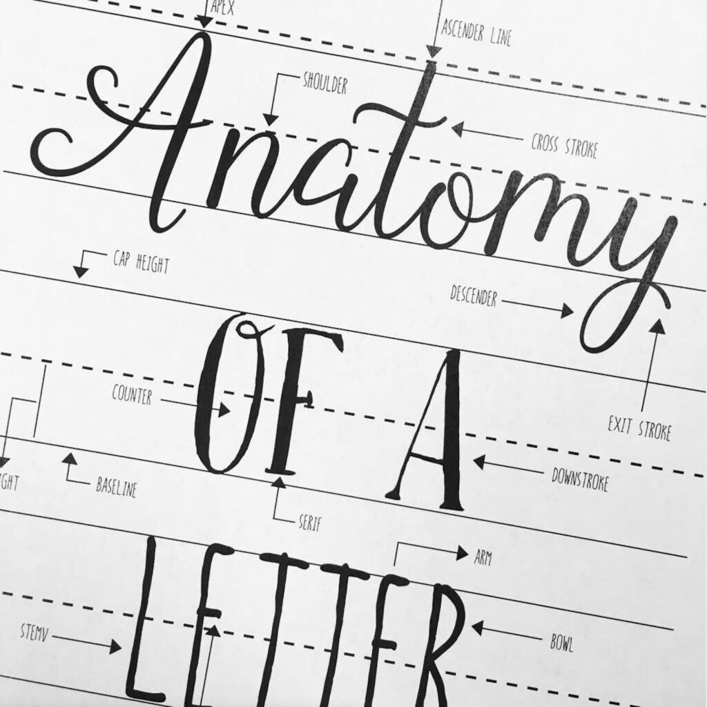
2. Learn the Anatomy of Letters
This is a key step to hand lettering for beginners because it will help you understand the fundamental components of each letter and how they work together to create words.
There are ascenders. Descenders. Ways to determine height. Even a term for the inside of a letter (the hole in the letter A…which is called a counter).
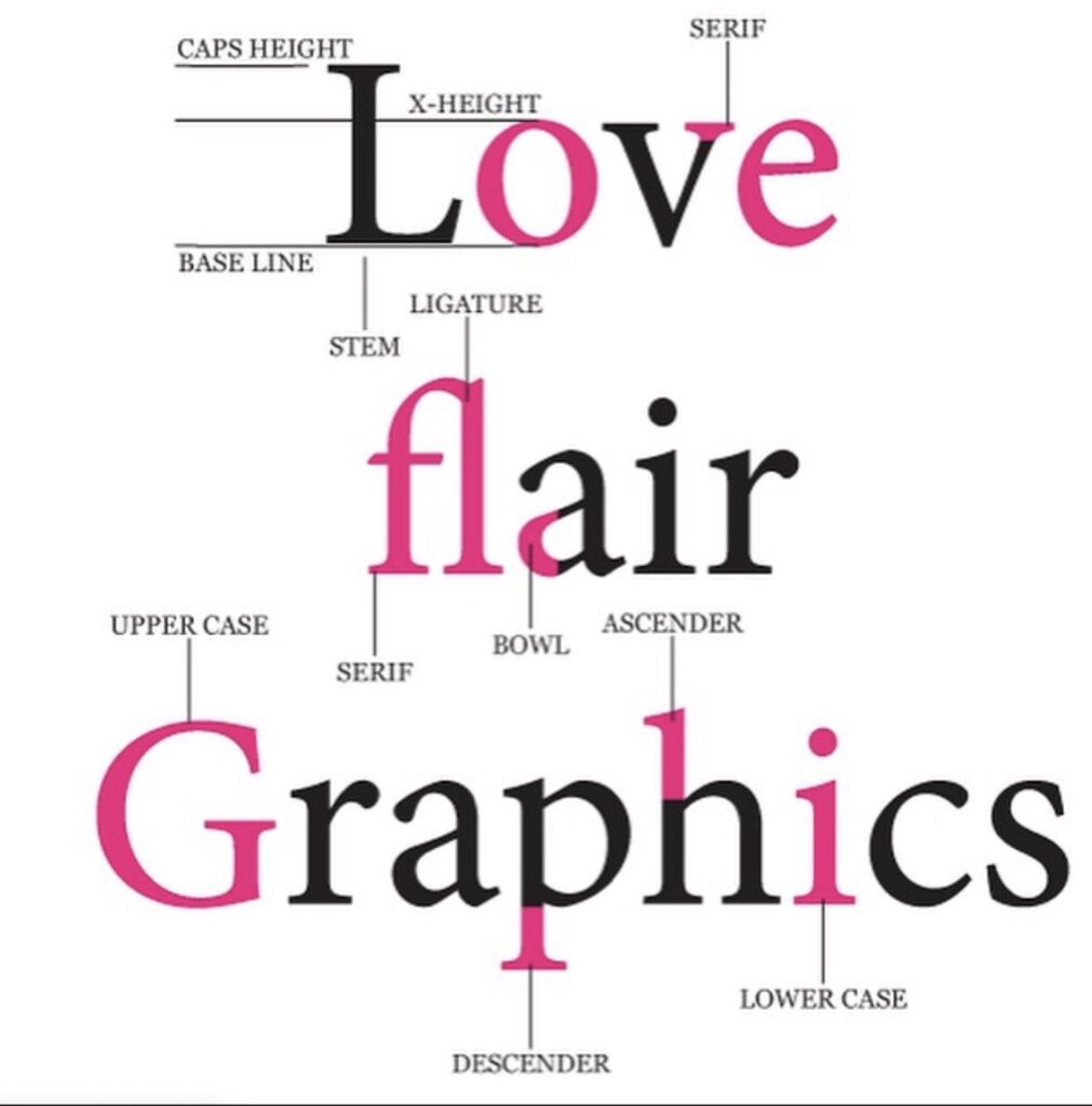
What are the three proportions of letters?
The height, the belly and the shoulder.
How do you layout letters?
Your layout will depend on the type of lettering you’re going for. For example, a lot of times I’ll do a vertical line down the middle of my paper and put half of my hand-drawn letters above it and the other half below it to create a symmetrical lettering composition. Other times I might leave more space on one side of the paper to allow for lowercase letters as well as upper case letters or maybe stretch out my words as if they were lyrics to a song.
You want to think about what kind of look you want your hand lettering to have before you start because there are roughly three different types: traditional, modern, and illustrated. Traditional is often considered the most formal style and this type of lettering is often done with a flat edge pen. Modern hand lettering can be more experimental and free-flowing and illustrates the organic and unique quality of hand lettering (somewhat like handwriting).
Illustrated means you’re drawing around your letters! This is perfect if you want your piece to appear sketched out or if you simply want to make your piece more dynamic.
Lettering takes practice, so use smaller pieces of paper to test out words and phrases to get the hang of positioning them correctly on the page.
3. Just Get Started
You already have the supplies, now it’s time to learn how to hand letter.
Don’t give yourself too much pressure! Just let the ideas flow and practice over and over again until you get it right. You can even do mini-sessions where you spend 10 or 15 mins a day working on your lettering. That’s when the magic can happen! Just remember to have fun with it.
4. Do Some Warm-Up Exercises
Once you’ve learned your letters, what’s next? You can then move on to words. But again, are you ready for words yet? I would suggest practicing with some lettering exercises first!
Just like doing warm-ups before a gym session, the practice will make perfect! Warm-ups are good for testing out your lettering and getting your hand muscles ready for the real workout.
So, what can you do? You can try out different ways of positioning letters, such as mirroring them or placing the words in a pattern. Or you might want to challenge yourself by writing one word per page and see if you’re able to write it five times without making any mistakes.
If you’re feeling really brave, why not try creating your own lettering pieces by using different fonts and combinations to create words or phrases?
For example, maybe you want to write out the lyrics to your favorite song. Or maybe you just need some motivation every day so instead of saying “you can do it!” you might choose to write “I can do it!” instead.
5. Practice and Then Practice Some More!
At first, your hand lettering might not look exactly how you want it to be, but that’s ok! That’s where the magic happens because every time you pick up your pen and put your ideas on paper, the more comfortable you will become with your own style.
For example, the way I letter is by letting my hand flow freely across the paper – there are no rules to lettering after all! And that’s what makes it fun. You can do whatever you want with whatever tools suit your fancy at any given time.
If you’re feeling discouraged, just remember practice makes perfect! And don’t beat yourself up if you make a mistake. Mistakes are often where the coolest looks can come from because once you mess up, it’s easy to cover your tracks by adding some cool swashes or decorative elements.
6. Have Fun with Hand Lettering!
There are so many resources for lettering now that it’s easier than ever before to find inspiration! And even if you don’t feel like you have a real passion or knack for lettering yet, practice makes perfect. If you aren’t feeling the love right now, try again in a week – it can make all the difference!
Try looking up some cool quotes (Pinterest is great for finding quotes) and take a stab at lettering them. Or if you find yourself loving it, why not create some artwork for your walls? It might be worth investing in a set of nice pens/pencils to help make your work that much more professional-looking.
And lastly, don’t give up! Sometimes I can spend hours on something and it doesn’t look like I thought. But that’s ok because the next day, or even sometimes in 10 mins time I can do something completely different with much better results. And that’s the beauty of lettering – there is no wrong way!
7. Just Get Started Lettering!
The point of this article is to help you get started lettering! There are so many different ways you can learn and practice but at the end of the day, just pick up a pen and let your ideas flow.
If something feels off or uncomfortable, don’t push it. You’ll only develop bad habits that might take a long time to break and who wants that? Just remember it’s all about having fun. Lettering should inspire you, not hinder you!
8. Produce a Finished Piece
At the end of the day, taking yourself out of your comfort zone is important because it gives you the chance to grow. And who knows? You might just find that lettering is something you love more than you ever thought!
But at the end of the day, don’t forget to create. Try writing something you feel with no outside influences and see what happens when you just let go.
And remember… it’s definitely ok if your first piece isn’t perfect because there is always room for improvement! Who knows? You might even find yourself in love with lettering!
Where Do I Find the Time to Learn?
Like anything else in life, if you are passionate about it or you want to make it happen, you can find the time. It doesn’t take a huge chunk of time to learn to hand letter. You can do it while you are sitting and waiting for someone or something. While you drink your morning coffee. And you can practice while you are making a shopping list, taking notes for school, or creating your headers in a planner or journal.
#1 – While Watching TV
If you watch TV, you can practice hand lettering at the same time. It’s perfect if you like to binge-watch shows on Netflix like I do!
#2 – While You Wait for Food or Drinks
Your order should arrive in about 15 minutes or so, but that’s plenty of time to write out some letters or words.
While you’re waiting for your order to brew, why not practice lettering? It’s also fun if you like to doodle!
#3 – While You (Don’t) Wait in Line
If you don’t mind standing people watching for a few minutes, hand lettering is an excellent way to pass the time.
#4 – While You’re Making Coffee
If you drink coffee each morning, you can practice lettering while your beverage is brewing. I like to pour over quotes and letters to keep my hands busy while the machine does its thing!
One of the best ways to practice lettering is to use it every day – and one way you can incorporate your pen work into your daily routine is by adding hand lettering as bullet journal headers. Since these lists and thoughts tend to change each and every day, it becomes a great opportunity for practicing different styles!
#6 – Taking Notes for Class
If you take notes from a teacher, professor, or other presenters in class, write out the words. If you’re taking notes from a video, write out the subtitles or pull quotes! Hand lettering can actually help you to focus better when writing down key points.
#7 – Letter Writing
If you have an important piece of mail that you need to send out, why not hand letter it? Just like handwriting, a note is more personal than using a computer, writing out the address and other necessary information by hand will make your piece of mail stand out – plus it’s fun!
#8 – Join a Challenge
Lettering challenges are great for keeping you on track and accountable for your lettering explorations. You can join a challenge at any level – whether it’s learning basic skills or creating something more advanced, there is always room to improve!
#9 – Start an Instagram Account
If everyone’s doing it and sharing their works of “art” on Instagram, why not try it?! It’s a great way to get inspiration and motivation by checking out other artists’ accounts.
#10 – Keep a Journal & Letter in It
If you’re into bullet journaling or just keeping track of your thoughts throughout the day, hand-letter each page. You can even share them with friends later on!
#11 – Create Art for Your Walls
Who doesn’t want custom artwork to hang on their walls? If you’re into DIY, hand-letter some words and turn them into art. Look through magazines and tear out images that speak to you and arrange the letters around it! You can even paint or draw your own template before arranging the letters and words.
#12 – Make a Playlist and Practice to It
If you love music, create a playlist and practice each time it comes on! Think of song lyrics that relate to your lettering – if you find yourself listening to the radio often, why not keep pen and paper near so you can try writing out some lyrics?
Does Your Brush Pen Really Matter?
Many beginners ask if their brush pen matters when trying to learn hand lettering. Absolutely! When practicing your craft, make sure you invest in high-quality pens. They really do make a difference.
While you can find budget-friendly brush pens, it’s best to splurge on the nicer ones.
Why?
First of all, they typically have better quality ink making them easier to use. Using a pen without great ink leads to more frustration.
Second, most high-end pens come with their own inks that are specially made for that style of pen. For example, the Tombow Fudenosuke pens come with their own ink (which is highly recommended since it’s made by the same company). With other pens like the Pentel Touch Brush, you’ll need to buy the right kind of refill to make your pen work well.
Finally, there are also differences in the way each pen handles – what feels right to one person doesn’t feel as good to the next! For example, some pens like the Tombow Fudenosuke TwinTone Pens brush have a more rounded end that’s easier for beginners, while the Pentel Touch Brush Pen is tapered and therefore preferred by more advanced users.
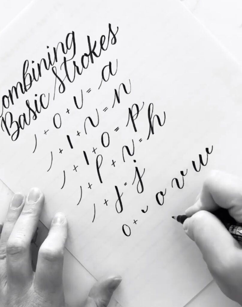
Letter Formation Comes First
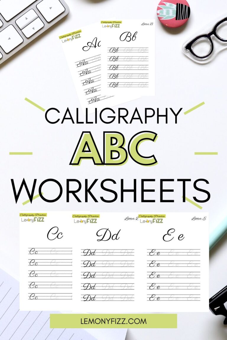
The first and most important hand lettering skill to learn is how to form letters. This is the foundation of the craft and not knowing how to do this properly will limit your creativity. Take the time to learn basic hand lettering and you will build a strong foundation. When you have the time, practice a lettering alphabet until you can do it without tracing or referring to practice sheets.
The next step would be to start practicing on a basic lettering project by drawing out letters with a pencil first. Make sure you’re consistent in your line thickness, pressure, and letter spacing as you draw out each letter. Once you finish, make sure you erase the unnecessary lines and clean up the letters so they look nice and neat.
You can also practice on tracing paper first: trace one of your favorite fonts onto the sheet and practice writing it with a pencil before moving onto a marker or pen. You can go over it as many times as you’d like until you feel more comfortable with it.
Lettering tutorials that can help you get started:
– Lynda.com has an amazing range of courses on calligraphy and lettering that will help you improve your skills.
– Skillshare is a website that features online classes for people who are interested in calligraphy, illustration, typography, design, crafts, and many other topics.
– YouTube has tons of videos on all sorts of topics relating to brush pen lettering – You can find instructional videos or watch video demos of artists’ work.
– Instagram has loads of talented artists who share their work every day. Follow them and watch your favorite lettering styles come to life!
Books for Hand Lettering
1. Lettering for Beginners

2. Lettering for Absolute Beginners

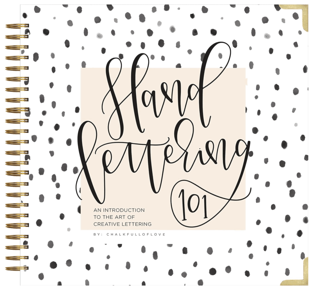
3. Hand Lettering 101: An Introduction to the Art of Creative Lettering (Modern Calligraphy Series): One of my personal favorites.
4. Hand Lettering for Lettering for Absolute Beginners Workbook: Complete Faux Calligraphy How-to Guide with Simple Projects
Combine Your New Skills
Once you’ve got those mastered, you can start putting your newfound skills together and create some awesome artwork!
Start by practicing with basic 3 letter words. Then you can try your hand at creating quotes or phrases once you’re comfortable with each letter. Practice writing them over and over again until you feel more comfortable before putting them on display.
One of the best ways to learn would be to do some research into the styles that resonate with you. Reading up on artists you like or seeing how they do their work is a great way to learn, especially if they share tutorials on their website.
To create great hand lettering, you need passion, patience, and persistence. First, you need to find your style or niche that will inspire you on a daily basis. Then practice, practice, practice!
You can create anything from quotes to comic strips – the possibilities are endless! Mix and match ideas to get the most out of your hand lettering practice.
Basic terminology
– splayed letters are when you have to letter in one stroke that is not horizontal, i.e. w, k, y
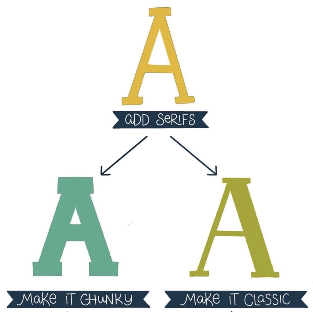
– serifs are the extra flourishes at the end of a letter’s stroke
– loops are when you have two strokes at the top of a letter
– slant is when your letters lean to one side or another
– baseline is the imaginary line that all of your letters sit on
– ascenders are the parts of the letters that go above the line
– descenders are the parts that go below the baseline, i.e. j, y, p
– counter is the part of a letter that’s inside
– x-height would be the height of an average letter in a font
– the thicker part of a letter is its thick spacing and the thinner parts are called thin spacing
– arches are when you have rounded letters that go above or below other letters in the word
– weights usually refer to line thickness, but can also be about how thick the letter’s strokes are
– trail is when you have a thin stroke that finishes off with an exaggerated loop at the end of the word
– spades are when you have exaggerated loops on letters to show movement, ex. f or y
– tails are when you have curved lines sticking out from the spine of a letter usually ending in a serif, ex. g
– the base of a letter is the thickest part of it
– the crown is the part of the letter that sits on the baseline
– crossbars are the bars within letters, ex. e & H
– flourishes can be part of your serif fonts – they’re used to add detail and make your lettering more interesting, ex. curlicues or swirls
– barbs are when you put extra strokes on letters to give them an angry look, like a z that’s been stabbed with a pen
What are the rules for hand lettering?
As with any creative project, there really are no hard and fast rules. Just a few guidelines that will help you succeed.
It’s always a good idea to have a few pieces of tracing paper to practice your letters. It’ll help you see the stroke weight and how your ascenders and descenders are working.
Always keep your pencil sharpened – I find that I’m happiest when my drawing instrument is in top shape.
When drawing with ink pens, always use an ink eraser if you go over lines or ink that you’ve already drawn on the page. You can also buy white acrylic paint if you want to whiten up areas of the lettering project. This way you won’t fill too many pages with graphite marks!
Consistency
Consistently hand lettering with a strong style and tone is the best thing you can do to make your lettering look good.
You don’t want to be left with a project that looks like it was done by fifteen different people – unless, of course, that’s what you were going for!
Spacing
You have to think about your spacing. You can use any kind of measurement system you want, but a good rule of thumb is the shorter the line, the closer your letters need to be. The longer your lines are, the more space you’ll need between each letter and word.
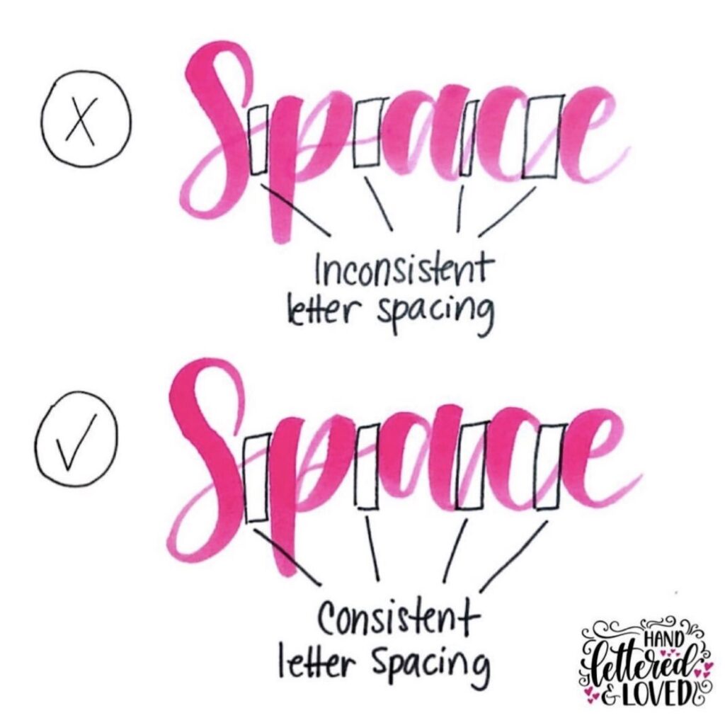
If you’re just starting out, don’t worry too much about spacing. You can always mess around with it at the end to get it right! Just make sure your letters are generally touching each other or sitting on the baseline.
This is not a hard and fast rule at all but is pretty accurate in most cases (depending on font size).
Style/Design
Think about what you like and want to convey through your lettering. What’s your style? You can quickly change the look of a word or quote by simply changing the weight and thickness of lines, adding flourishes here and there, etc.
The Anatomy of Letters
The parts of letters are called ascenders (parts that go above baseline), descenders (parts below baseline), crossbars (inside letters like “e” or “H”), serifs (extra strokes used as decoration on fonts like “g”), barbs (strokes added for an angry look like a z that’s been stabbed). It can be helpful to trace over letters to see how all the different pieces work together.
The Base Line
The baseline refers to the thickest part of a letter and is usually at the bottom. Normally this sits on the baseline but it can also sit above or below depending on style and design.
The X Height
The x-height (or body) is the height of all lower case letters. It’s what you’ll use as a measuring tool when writing out quotes and short words like names, basic verbs, etc.
The Ascender Line
The ascender line is the part of a letter that goes above the x-height. It’s usually found on letters like “h”, “k”, and sometimes “b”.
The Descender Line
The descender line is the part of a letter that goes below the baseline. This can be found on letters like “p” and “y”.
Arches
Arches are when you have rounded letters that go above or below other letters in the word. It’s basically any curved stroke that is meant to be part of a letter.
Tails/Serifs
Tails are the ends of letters that go below the baseline, but can also curl up above it as well. Serifs are extra strokes added to embellish certain letters – they are usually at the bottom.
The Line Thickness
You can play with the thickness of lines, but a good rule of thumb is to stick to a consistent line weight. You can easily change up your lettering by thickening/thinning lines, using different widths from thin to thick. If you’re just starting out, keep your lines simple with a consistent thickness.
Serifs and Barbs
The serif is the small stroke used as a decorative element to create flourishes and other details. Serif can be easily added to any letter, ex. “g”, “k”, or numbers like “5”. The barb/barbwire is the angry-looking little extra line found on letters like “z” and “q”.
How to Use Anatomy in Hand Lettering
Once you learn the anatomy of letters, it becomes much easier to quickly sketch out your lettering. Just remember what goes above and below other letters. For example, if I wanted to write “I love you?” I would make the tail on the “y” go below all the other letters. The “l” and “i” would be taller. The other letters are the “x” height or the average height. You can also try adding serifs and flourishes to create a fun and unique look.
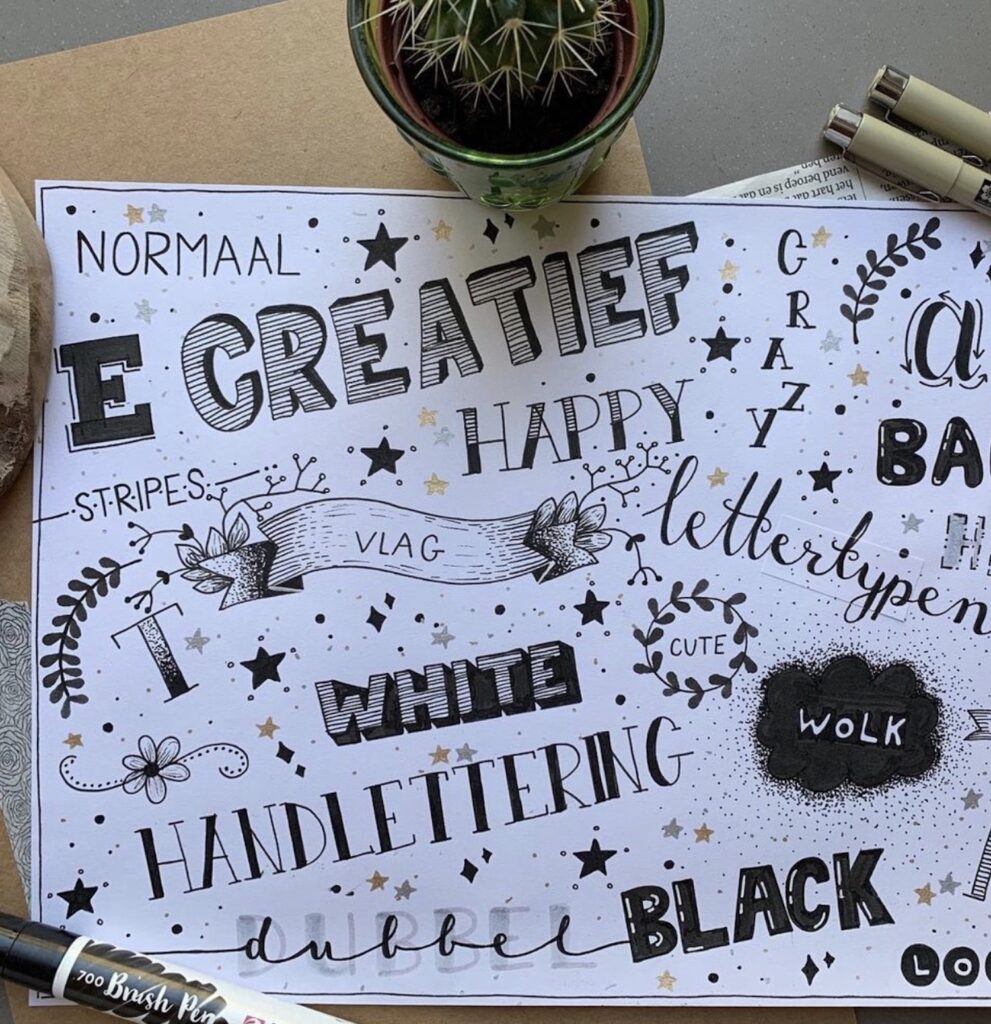
Basic lettering styles: Lettering Families
Lettering families are groupings of letters that share common traits. These are usually referred to as “fonts” and there are hundreds of thousands (probably even millions).
Typefaces are the actual fonts. Even if it’s your handwriting, you’re using a typeface (or font).
Some are serif, some are sans serif, some are script, etc.
You can find the ones that work best for you by playing around with them in Adobe Illustrator, Google Fonts, or simply looking through Adobe’s Typekit.
Serif Fonts
Serif fonts are the ones with extra decorative elements, like strokes or barbs.
They can be used in lettering to create a more polished look or for when you want your letters to appear more traditionally handwritten.
Examples of serif fonts are Old English, Palatino, and Baskerville.
Sans Serif Fonts
Sans serif fonts are the ones that don’t have any decorative strokes or barbs.
They’re usually best for when you’re looking for something clean and modern-looking. They’re perfect when you want your hand lettering to look professional.
Examples of sans serif fonts are Lucida Grande, Univers, and Futura Medium.
Script Fonts
Script fonts are usually incredibly elegant-looking.
They work well for wedding invitations, swanky restaurant menus, or whenever you’re trying to create a fun and flirty feel.
Examples of script fonts are Bickham Script, Lobster Two, and Sofia Pro.
Decorative Fonts
These are some pretty popular fonts that might not be considered “handwriting”, but they’re perfect whenever you want to add a little pizazz to your lettering.
They’re usually incredibly ornate with extra flourishes and even barbs that have a dramatic flair. They can be used in place of script fonts for an elegant look or in conjunction with them for something truly spectacular. Examples of decorative fonts are Dancing Script, Big Noodle Titling, and Lobster.
Can’t make up your mind?
Try mixing up the fonts.
For example, use a script font for your first word and serif for your next. Or try using sans serif on the numbers of your date.
Line Weight in Lettering
If you’re looking for a traditional, handwritten effect, stick to the average line weight. But if you’re wanting something spiffy and clean-looking, make your lines thinner. If you want something to be bold and strong, make your lines thicker.
Line thickness can have a huge effect on how your lettering reads.
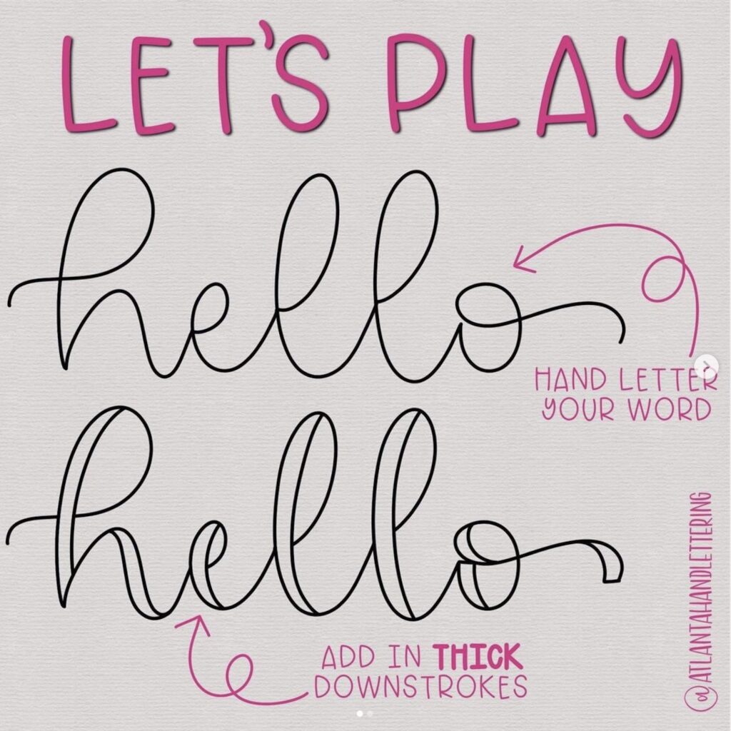
Downstrokes and Upstrokes
Downstrokes are lines that go from the top down.
Upstrokes are lines that go from the bottom up.
Downstrokes can be very dramatic and readable; upstrokes are usually light and more organic-looking.
You can use them individually to add emphasis, or you can mix up your downstrokes and upstrokes when you write out a word for an elegant effect.
The beginning of your downstroke is where the pressure starts in order to make it look like a sharp, clean line.
As you move down the letter, the pressure decreases in order to make it flow into the top of your upstroke or loop.
This will create a wavy line that is more organic-looking and elegant.
The end of your downstroke is where the pressure takes off entirely so it flows easily into your upstroke.
As you move across the letter, your downstroke should slowly come to an end and your upstroke will start naturally. This will create a soft line that’s more dramatic and easier to read (for those who don’t like script fonts).
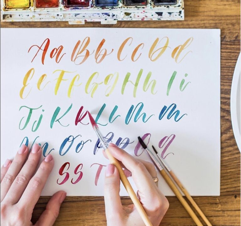
What is Brush Lettering?
Brush lettering is done with a brush or marker pen.
These are typically thick, flexible markers that give you the ability to create larger downstrokes than if you were using a pencil or fine-tip marker. The brush tip is what adds detail to this type of lettering.
The point of this type of lettering is to give it an organic look, so there’s no pressure on where to start and end your letters.
You can also use a paintbrush or even a regular marker for this type of lettering, but it will give you an effect that’s different from what we’re looking for in this article.
If you want something really organic-looking, make sure you don’t press down hard on the paper.
Start with the thickest part of your brush near the ferrule (where it meets the handle).
This will give you a thicker line because this is where the most pressure comes from.
As you work your way up to your thinner parts, make sure to ease off on the pressure so you don’t end up with something too thick.
You can also start from the thin tip and work your way up to where it’s thickest for a different effect.
If you want a fun, simple script, try using the thickest part of your brush near the ferrule at the beginning of each stroke so you have nice upstrokes and downstrokes.
Then gradually ease into the thin parts of your brush toward the end, varying the pressure so that some letters are thicker than others.
What is a Brush Pen?
A brush pen is a marker that has an angled tip like a paintbrush.
This type of lettering will give you something similar to pointed pen calligraphy if your letters are on the thinner side. If they’re on the thicker side, it’s more like painting or calligraffiti. This type of lettering is typically done with water-based ink or paint.
Look for brush pens that have a flexible tip so you can get that organic look with your downstrokes. Try to find something that’s not too thick because it will give you more control over how much pressure you’re putting on the paper.
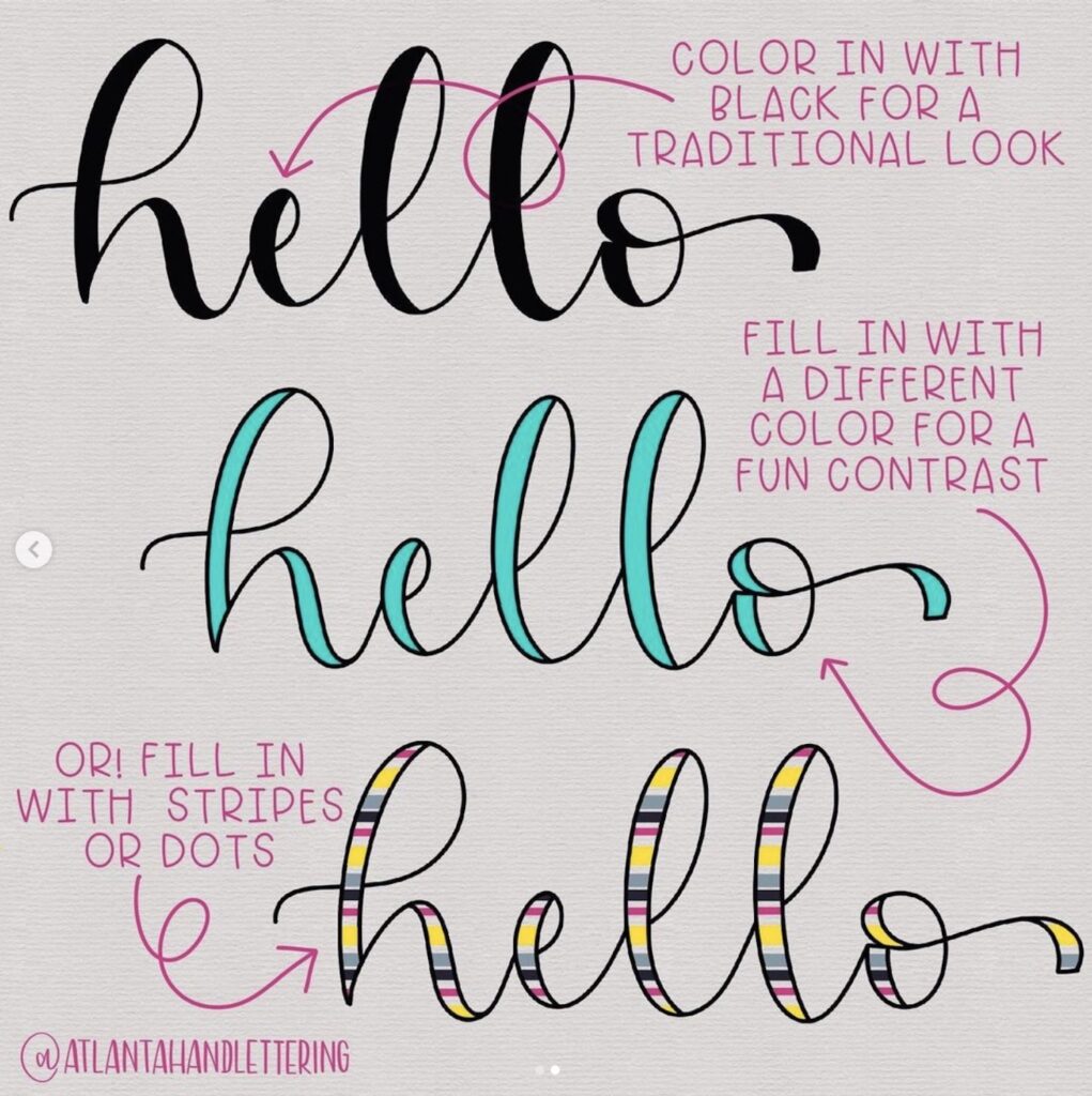
Adding Embellishments
Adding embellishments to your lettering can give it a really nice effect.
It will add an element of interest and make the piece feel more complete.
You don’t have to add embellishments, but you might want to if you’re having trouble making it look elegant or when you feel like there’s something missing when you’re done.
You can add any kind of embellishment at this point, but these are some ideas to get you started:
- Curls seen in calligraphy
- Jazzy swashes
- Colored brushstrokes or highlights that flow with your letters if you used a paintbrush for lettering
- Anything else you want to add
How to do Bounce Lettering
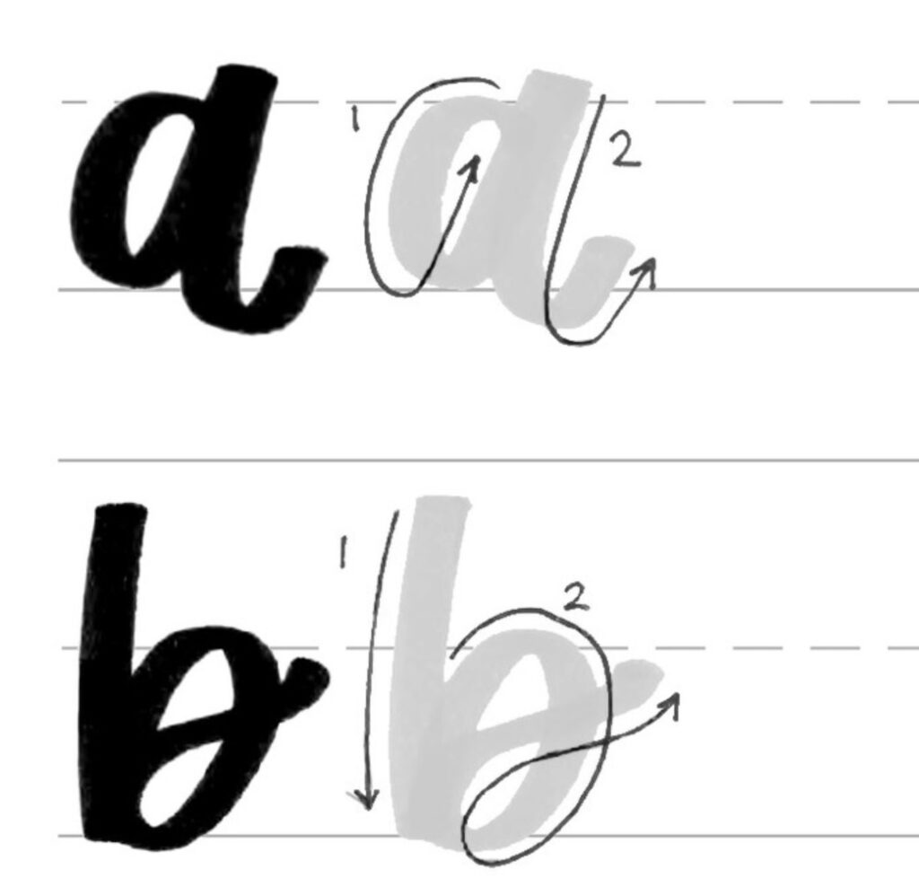
Bouncing your brush or marker is done with an upstroke, so you can think of it as a double upstroke.
It’s something like the natural motion you’d do if you were writing by hand, but instead of going down at the bottom of each letter, you go back to where you started your stroke and repeat it.
Start with any letter.
To do a bounce stroke, you first go down into the paper and then return back up toward where you started.
You might end on a slightly different part of the letter depending on what looks best.
For example, for a lowercase b, I usually bounce on the right side of the stem.
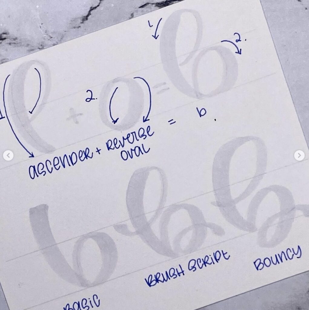
For a lowercase o, I usually bounce once or twice near the beginning and end of the loop at different points depending on what looks best.
Since there’s no pressure with this type of lettering, you can try to see where your natural rhythm takes you and just go with it.
Flourish Fancy Type
This type of lettering is really fun to do and it’s easy because you’re basically drawing.
You can use any letter, but I like to start with lowercase since it has more personality.
Start with your brush or marker resting on the paper.
Pick up the end of your brush or marker without pressing down so that your brush or marker is straight up and down.
To get a flourish fancy letter, you’re going to quickly go from the top of the paper all the way around so that you can see how it curves. Then you start from the beginning again and repeat this motion until you get something that looks good.
If for some reason it doesn’t look good, you can always erase it and start again.
You can make your flourish fancy letters as simple or as detailed as you want them to be depending on what looks best.
Remember that if something isn’t working, you can always erase it and start over. You might have to practice a few times before it looks perfect, but that’s normal!
Borders, Doodles, and Textures
Your hand lettering doesn’t have to be a stand-alone piece.
You can always add a border or doodle something around your letters if you want.
Adding a border is a really nice way to finish off your lettering piece.
You can add a border with decorative tape, stitching, or any other embellishments you have on hand.
If you’re going for speed, try making doodles and textures with just the marker or brush pen since it’s fast and easy. You could also try adding textures or effects with paint or stamp pads.
To do this, just add a series of random lines and curves that flow with the curves in your letters.
It’s not necessary to trace all your lettering with these lines and you can even let them go outside the lines. It’s nice when they overlap and intermingle with each other because it will give the piece depth.
It’s not possible to mess up with these doodles and textures, so just have fun with them!
You can use your brush or marker for this or even a metallic gel pen if you want something more elegant.
Troubleshooting
Making mistakes is totally fine, but as you’re practicing or trying new letter combinations, it might be hard to tell what exactly looks off and why.
If something doesn’t look right, it could be one of these things:
The way the letters fit together
Space between each letter
The way each letter flows into the next one
In most cases, it will be a combination of all of these things.
You can fix spacing by playing around with how close or far apart your letters are.
If you need to space them out a bit more, start by pressing down harder with your pen or marker so that your letters are more widely spaced.
If the letters themselves don’t look right, you can try switching up their order or simplifying them by connecting some of the lines between each letter.
How hand lettering differs from calligraphy?
Hand lettering and calligraphy have a lot of similarities, but there are a few main differences.
The first is that hand lettering does not use a ruler or guidelines. There’s no accuracy needed with your letters since it’s all about the flow.
Calligraphy, on the other hand, does use a ruler and guidelines to make sure your letters are straight and evenly spaced.
Another difference is that hand lettering can be done with a brush pen or marker while calligraphy is typically done with a pen.
Hand lettering also includes doodles and textures, whereas calligraphy just has letters/text.
How to Hold Your Body for Lettering
No matter what style you’re going for, it’s important to have a consistent body position.
Having a good body position will help your movement with the pen and also keep your hand from getting cramped up or tired too quickly.
Here are some basic rules:
- Keep your arm relaxed at all times- don’t form a fist or keep it too tight.
- Relax your shoulders, but don’t let them droop.
- Keep your wrist loose and do not bend it up or down. It should be kept as straight as possible with the pen at a 90 degree angle to the paper.-
And finally…Don’t grip the pen too tightly! Keep it fairly loose so that you can move it easily.
How to Sit for Lettering
Where you sit is important, too!
It affects where your hand moves and how quickly and smoothly you can form letters across the page.
Here are some guidelines:
Ensure that your feet touch the ground and it’s not necessary to balance on one foot. Resist the urge to put them up on a stool or chair.
Position yourself at a desk where you have plenty of room for movement.
If the desk is too low, you might want to put a pillow or blanket underneath your arm so that it’s more comfortable.
Make sure that the paper isn’t too high or angled- this will cause your hand and wrist to become more tense than they need to be.
Slouching or hunching over will only cause you to cramp up.
Keep your back straight and maintain a soft bend in it.
Make sure that your elbow is resting comfortably on the desk with the paper at eye level, not below or above. You could also use an easel if necessary!
It might take a little while to find the perfect position for yourself, but once you do, it will be much more comfortable and result in better lettering.
How to Hold Your Pen for Lettering
Hold the pen from the middle of its body (nib-end not cap-end). You should be able to draw a vertical line down the middle of the nib under your grip.
The highest part of the pen body should be at a 45-degree angle to the paper.
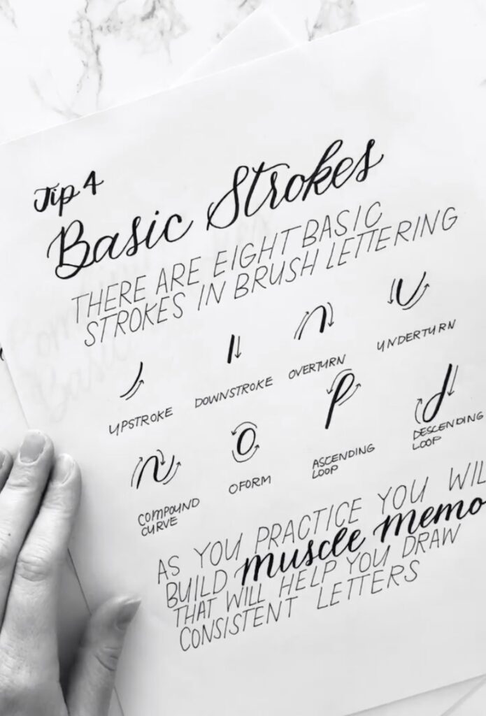
How to Develop Muscle Memory for Lettering
Developing muscle memory is key in making your hand lettering look natural and effortless.
It will take a lot of practice, which you can either do by writing out letters over and over or tracing them out.
How to create a hand lettering piece – a 6 step process
Step 1 – Plan! What are you going to create?
The first thing you want to do is come up with an idea. Are you going to make wall art, a card, or address an envelope?
Step 2 – Gathering Inspiration.
Look for inspiration. Get ideas from multiple sources. What do you like about each one? What would you change? Mix and match to come up with your own version.
Step 3 – Thumbnail Sketches
Sketch out small versions of your idea. This is a great way to make sure your design flows, you have thought about your spacing and the elements that will bring your whole piece together.
Step 4 – Sketch it Out!
Sketch your design out with a pencil (very lightly). Using a pencil first will give you the ability to make changes without ruining your paper, envelope, or whatever else you are designing on. Adjust spacing, add other elements, etc. as needed to create a polished piece.
Step 5 – Inking Your Final Design!
Now you ink. Go over your lines with pens, markers, paint, whatever your medium of choice. This will be your final design.
Step 6 – Removing the Pencil Marks.
If there are pencil marks showing, wait for your ink to set or your paint to dry. Don’t rush this step. Walk away for a bit so you aren’t tempted to fiddle.
When you are sure the piece is cured/dried then you can use an eraser to remove any visible pencil marks. Clean up your art and then you are done!
Display it with pride.
How do you practice hand lettering for beginners?
There are many ways to practice hand lettering for beginners. You can use your favorite pencil or pen, chalk, or brush pens, you can use an inkwell and dip pen…Regardless of which method you choose, it’s important to start out with lettering styles that are easy to read. With practice, your letters will develop a personal style – suiting any occasion they’re used for!
How do you master hand letters?
Practice. Practice. Practice. Keep learning, keep trying and you will just get better.
How do you design hand lettering?
Hand lettering designs can be created digitally, or traditionally. Learning letter formation, the basic elements of design, and typography are the best place to start when designing hand lettering. Then let your creativity flow and see what you can design.
Look at other pieces for inspiration and pick the parts that you like best. Blend them together to make your very own hand-lettered art.
How do you layout calligraphy?
Before starting, decide whether you’re going to use an alphabet template or work with just the guidelines of the alphabet. When working with a template, it’s best to put your page on an angle so that you can use gravity rather than following the curve of the paper. Keep in mind if you are writing along rectangular lines, thirty degrees is about optimum for readability.
Determine how much space there will be between each letter and write limited words at first so that you don’t lose track of their shapes too often.
Once all words are in place using a ruling pen or pencil, go back and fill them in by hand using very light pressure. The downward pressure creates darker letterforms that create more contrast against lighter ones for improved readability.
How do you do nice lettering?
One way to improve your lettering is to write out sentences of dialog. Using the same word repeatedly will help develop more consistent serifs. If you practice until it feels natural, it can become second nature!
Practice the basics: stationery, envelopes, gift tags, greeting cards, thank you cards – get comfortable with mastering these before doing any typeface that needs creativity.
Use tracing paper under your hands for better precision and control
Create guidelines on top of your hand lettering or typeface design for consistent spacing.
Find a pen or brush that feels good in your hand and you are comfortable with the weight.
Experiment with different pens. There are numerous types of pens, pencils, and brushes that can be helpful when hand lettering.
Vary the thickness of your lines for different effects.
Work on multiple projects so you don’t feel overwhelmed with perfectionism. Stand back from time to time to look at your work with an unbiased eye!
Is it necessary to be guided in lettering?
The truth is, there is no single way to learn handwriting. The only universal principle when it comes to learning how to letter well, is repetition.
That said, the best way to work on your calligraphy skills will depend on your desired outcome. For example, there are tools available for digital hand-lettering (some of which go beyond standard types like watercolor and photo brushes). But these tend not to be advised for beginners – instead start off with a pencil, pen, or brush-pen and paper before moving onto the computer. This ensures you have mastered the fundamentals before trying out more complicated styles!
What lettering style is the easiest?
There is no one lettering style that is the easiest. It all depends on what you are comfortable with, what experience you already have, and whether you want to use a pen or a pencil or something unique for your hand lettering. For example, a Q-tip or an eyedropper can be used as a way of adding ink to your strokes for different effects. Practice makes perfect, so have fun!
How long does it take to learn hand lettering?
This varies from person to person and it can take anywhere from a few months to over a year. The best way is to find what you like the most and start getting comfortable with it before progressing onto something different.
But before starting any type of lettering, make sure you master the basics. Stationery, envelopes, gift tags, greeting cards and thank you cards are all things that will help get your feet wet and then jump into something more advanced. And remember: practice makes perfect!
How do you outline letters by hand?
Use a pencil (and ruler if you prefer) to lightly place the letters on your paper, making sure they are spaced out evenly.
Choose a pen of your choice and outline the letters. If you are using a brush pen, you will go over your pencil lines and create the full shape of the letter. You can later go back and outline the brush marks with a darker-colored pen or black liner pens.