All About Cursive Lettering And How It Can Help Your Writing Skills
We may earn a small commission for purchases made through affiliate links in this post. For more information go to our Privacy Policy.
Do you use cursive lettering in your daily life or creative projects? Or do you want to learn how? This once-common form of writing lost popularity, but it’s gaining attraction again, thanks to the explosion of script-style digital fonts. Here’s everything you need to know about cursive letters and a few of my top picks for digital cursive lettering styles.
If you are interested in hand lettering or calligraphy, cursive lettering probably looks familiar to you.
Some people may associate cursive letters with writing from the 19th and early 20th centuries when that was a common form of communication (think: actual letters in the mail!). Or you might remember your mom’s (or grandmother’s!) beautiful cursive writing.

Maybe you were even lucky enough to learn it in school (before around 2010) when teaching letters in cursive was still part of the curriculum. Or perhaps you are simply familiar with cursive because you gravitate toward beautiful script fonts.
No matter how cursive fits into your life (or how you want to pull it into your life), it’s important to note that many people mistakenly use the terms cursive, script, calligraphy, and hand lettering interchangeably.
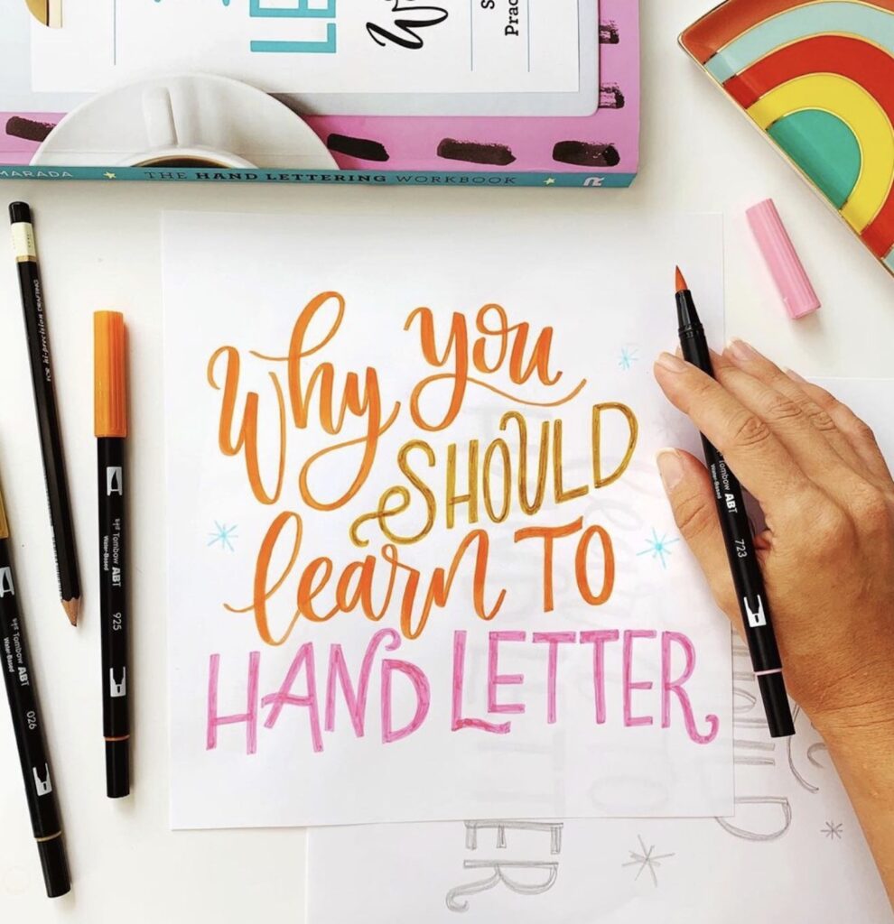
Calligraphy, hand lettering, and cursive have many similarities, but they are all distinct lettering forms (or writing). If you love beautiful lettering, it’s essential to know the differences between these three forms.
Cursive vs. Other Forms Of Lettering
Before we dive into cursive lettering and its many uses and benefits, let’s first take a moment to eliminate any confusion by clarifying the distinctions between the different forms of lettering.
What is cursive? Are cursive and calligraphy the same thing? These are common questions that people ask because there’s some confusion around the similarities and differences of cursive vs. calligraphy and other lettering forms.
Are they simply different terms to mean the same thing? Not at all. The most important difference involves the process used to produce the lettering and basically comes down to writing vs. drawing.
Here’s a quick breakdown of each style:
Cursive
Cursive is a form of writing because you use a single stroke to create each letter (except for crossing letters like “t”). In other words, all you need is one fluid motion to form each letterform.
What’s more, cursive lettering styles involve connecting letters to one another to form a group or a word.
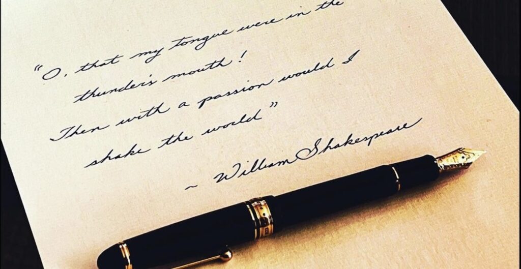
Calligraphy
Calligraphy is another form of writing because you form each letter with one stroke. However, calligraphy necessitates using special pens or brushes to achieve variation in stroke thickness that isn’t a part of cursive lettering.
In calligraphy, you may connect letters in a word with each other (called script calligraphy). Or you can keep them separated, depending on the style of calligraphy you wish to use.
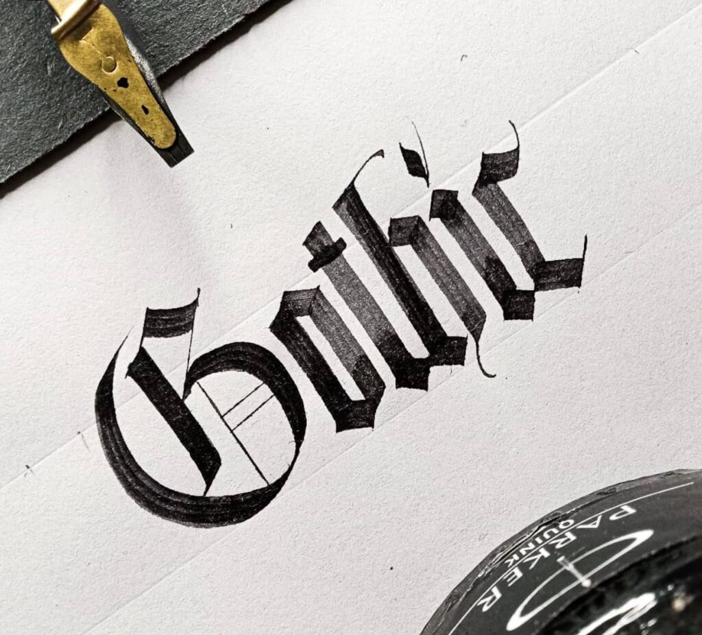
Hand Lettering
Hand lettering, on the other hand, involves drawing each letter with the use of several strokes rather than writing one fluid stroke. With hand lettering, you start with a basic letterform and build it up with additional strokes to create letters that may look similar to calligraphy.
The letterforms can also connect to create a script style (see why these terms get confusing?), but the method for forming each letter is different.
Script
The term ‘script’ typically applies to anything that looks handwritten in a similar style to cursive or script calligraphy.
There are three main families of letter styles: serif, sans serif, and script. So script refers to the overall writing family, and cursive is a member of the script family.
Although the word can refer to handwritten styles, people also use the term for handwritten-looking digital fonts.
What is cursive lettering?
Now that we got those letterform distinctions out of the way, let’s explore cursive a little deeper. Since cursive isn’t taught in schools anymore, I want to break down further how cursive differs from other forms of writing or lettering.
Qualities of writing letters in cursive include:
- Writing letters that connect to form words.
- Using a monoline tool: pencil or pen (instead of a brush pen).
- Applying equal pressure to each stroke (downstrokes aren’t necessarily thicker than upstrokes).
- Faster letter formation for quicker writing.
- Legibility – the purpose of cursive is efficiency rather than art.
A Quick Cursive Lettering History Lesson
No, we’re not going all the way back to caves or stone tablets. 😉
We’ll pick up this history lesson at the time when scribes used ink and quills because that’s when writing began to make some significant changes.
As scribes were translating texts and recording history and other essential items, they found it faster and easier to join the letters together. Plus, it was less tiring due to lifting the pen less frequently, which also helped reduce splattering ink and damaged quills.
Over time, there have been several dominant (or preferred) cursive lettering styles, and today many people classify cursive into two basic techniques:
- Casual cursive – this style highlights joined letters and pen lifts to create a combination writing style. Some letters are connected in a word, while others aren’t.
- Formal cursive – this style uses one flowing stroke to join words together with pen lifts occurring only between words.
Lettering Cursive Benefits
For centuries, people have believed in and experienced the benefits of letters in cursive. Even schools taught young students how to write cursive letters.
Sadly, since around 2010, most elementary schools don’t teach children those skills anymore. Kids loved learning to decipher all the loops in order to figure out what was written on the page!
There are many benefits to learning cursive lettering. For example, cursive:
- Provides terrific pencil control practice.
- Helps you improve your handwriting.
- Makes writing quicker, so you can get your thoughts on paper faster.
- Speeds up the flow of ideas.
- Results in fewer mistakes on the paper.
Cursive Lettering: Tools Needed
As with lettering (and different from calligraphy), you don’t need any expensive or fancy tools to get started. All you need to get started are a pen that feels comfy in your hand and some paper.
Depending on your comfort level, you may prefer using plain copy paper or lined paper (like you find in notebooks or journals). Either works very well!
As far as pens and pencils go, I recommend finding one that feels good in your hand. When you’re comfortable, your cursive will look amazing.
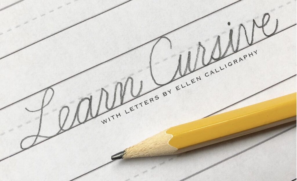
Lettering Guidelines
For the most part, cursive lettering is pretty basic to allow for quick and legible thought flow. However, everyone should know a few terms to understand the guidelines for creating cursive letterforms.
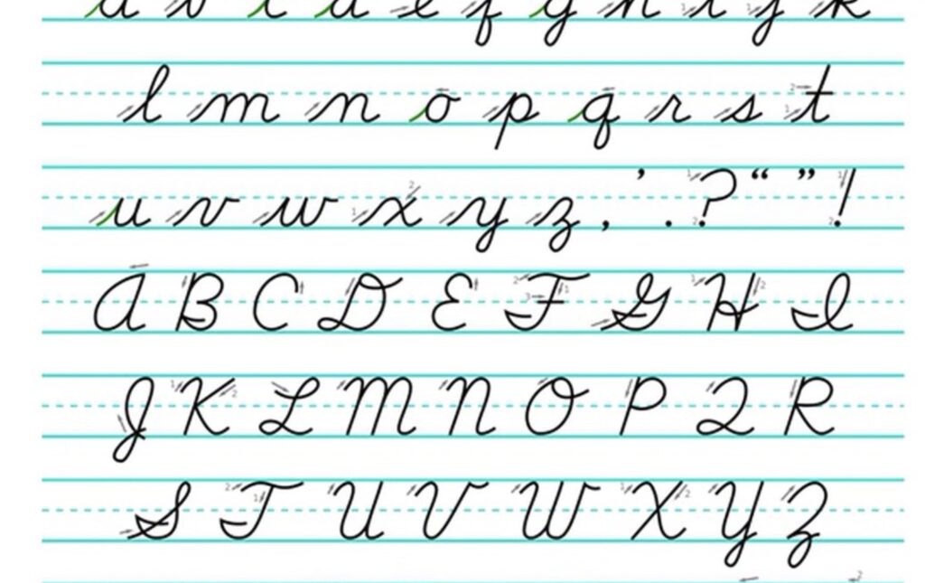
- X-height – this is the height that most lowercase letters reach (ex: x, c, a, s, etc.)
- Baseline – this is the lower line where all letters “rest.”
- Ascender – this refers to the top line where tall lowercase letters that rise above the x-height touch. An example would be the upper stem in the letter “d” extending higher than most lowercase letters.
- Descender – this refers to the line below the baseline where the tails of some lowercase letters touch. An example would be the tail of “y.”
Whew! Now we can cover some guidelines for writing letters in cursive. Most styles of cursive lettering use these guidelines, but some capital letters may vary slightly.
- All letters rest on the baseline.
- All similar letters should be the same height.
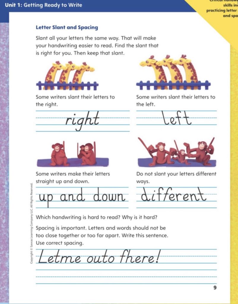
- Letters slant slightly toward the right side of the paper.
- Letter body shapes form an oval instead of a circle.
- Capital letters shouldn’t be higher than the ascenders of lowercase letters.
- Letters form a pattern of ovals and parallel downstrokes.
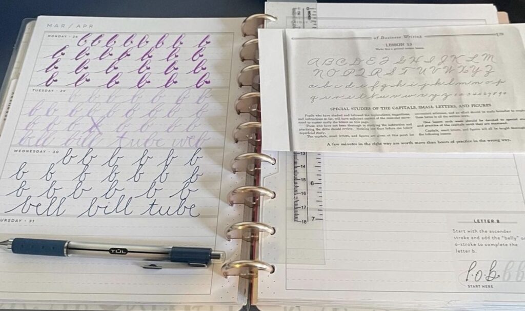
How To Practice Cursive Lettering
Like most things, it’s easier to learn how to write letters in cursive as a child than as an adult. However, if you didn’t learn cursive lettering in school, don’t worry. Developing skills for lettering cursive isn’t a “can’t teach old dogs new tricks” situation!
You can learn cursive lettering, but it’ll just take a little more practice! These suggestions may help make the process easier.
Hold The Pencil Correctly
This part might seem the hardest and take the longest to master. However, it will also make the most significant difference in your letterforms.
Grip the pencil (or pen) in your hand between your thumb and index finger so that it rests on your middle finger. As you write, your grip should be loose to avoid hand muscle fatigue and stiff lettering.
Position The Paper Properly
Many people tend to hold their paper straight or lean it in the opposite direction than they want it to. Correct paper positioning makes writing more manageable and ensures legible letters.
Right-handed writers should tilt their paper slightly to the left so that the top right corner lines up above the bottom left corner. Both of those corners, in turn, line up with the writer’s nose.
Left-handed writers should simply flip these instructions by tilting their papers to their right so that the corners line up to their noses.
Do Exercises
Because cursive lettering uses continuous, steady strokes, writers will benefit from practicing movement exercises such as connecting ovals or curves. This will help build the muscle control necessary to form steady and beautiful lettering.
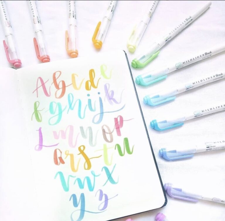
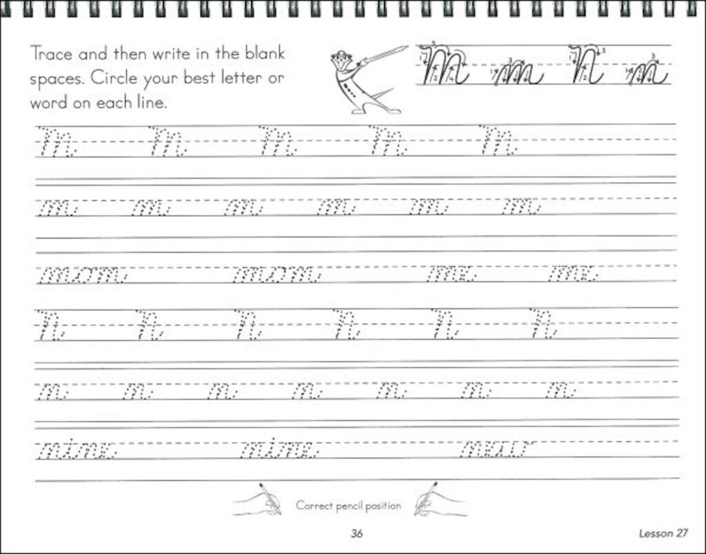
Practice Letterforms
The only way to get better is to practice! Once you feel comfortable with the movement exercises, begin learning how to form letters. Then work on how to connect them.
Expect progress to be slow-going right at first. But once you get a little experience under your belt, you’ll quickly make new advances in form and speed!
Tips To Help Improve Cursive Lettering
Here are a couple of helpful tips to make the learning process easier.
1. Start By Learning The Lowercase Letters
In general, lowercase letters are easier to form. They also tend to be more uniform across lettering styles, so I recommend learning them first.
Begin by learning the letters that have only one simple stroke (“c” and “o”) before moving on to letters that have more complex strokes (like “h”).
2. Move On To Learning Capital Letters
Once you’ve gotten comfortable with the lowercase letters, begin learning the uppercase forms. Start by learning “C,” “E,” “L,” and “O” before proceeding on to other letters.
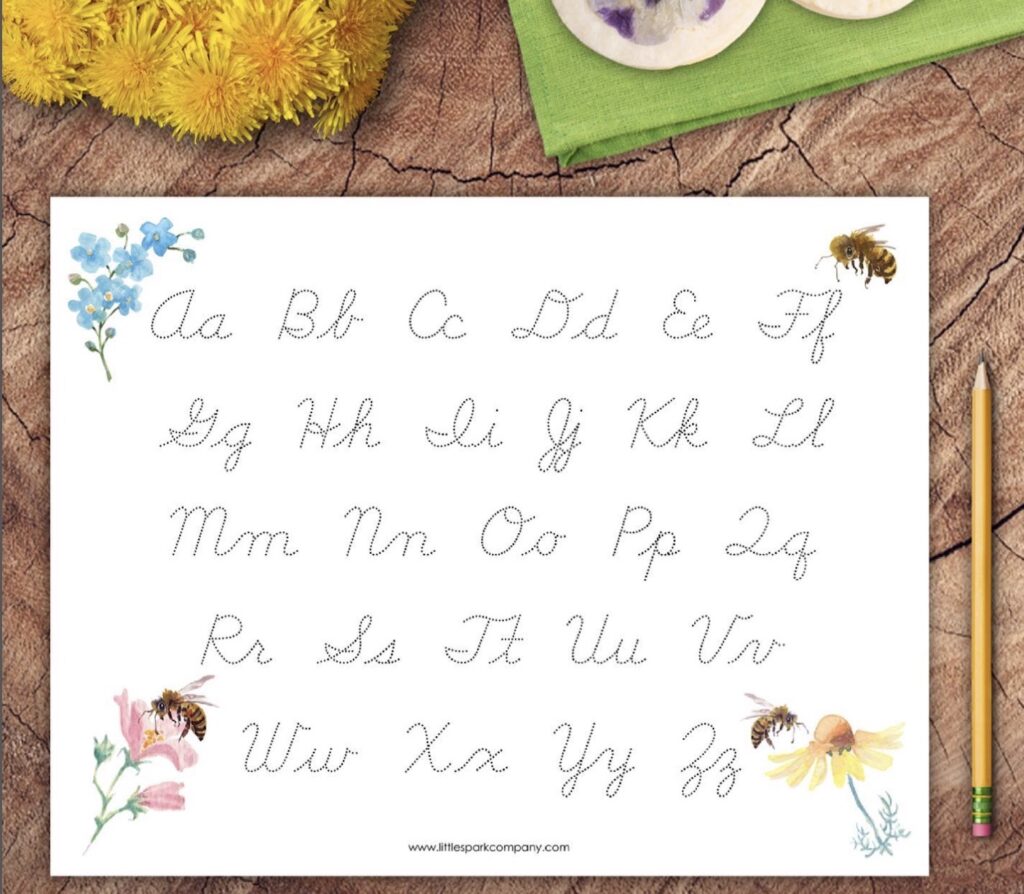
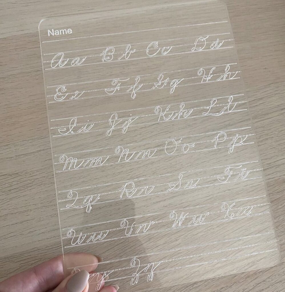
3. Don’t Be Afraid To Trace Letters
If you need a little extra help at first, that’s okay! Feel free to trace letters in cursive until you feel comfortable enough to try them independently.
You can find some great free cursive worksheets at Surya’s Cursive. Not only do the sheets have the letterforms, but they also have arrows directing you in the direction to move your pen.
Handwritten Cursive Lettering Styles
There have been many different cursive writing styles over the past 300-400 years! However, here are the types that you’d most likely be familiar with (since they’ve been used in the last 100 years and taught in school).
Palmer Method Of Cursive Lettering
Austin Palmer developed a simplified version of the previously popular ornate Spencerian Script. The Palmer style of cursive experienced a boom in popularity from the late nineteenth century to the early twentieth century as a script used in business.
You can still find it being taught today for various business writing needs.
Zaner-Bloser Cursive Writing
This style (another simplified Spencerian Script) became popular starting in the late nineteenth century after the Palmer Method’s popularity began to wane. It features letters that slant to the right and have distinctive tails and hooks.
Thanks to its popularity, it was a mandatory part of classroom curriculums for many years and was commonly used in business communications.
There is a manuscript form in the Zaner-Bloser style, but it differs significantly from the cursive styling.
D’Nealian Cursive Lettering
Derived from the Palmer Method, D’Nealian handwriting was developed in the 1970s as a way to teach children just learning to write a style of printing (manuscript) that would more easily transition to learning cursive.
The manuscript style matches the cursive letterforms more closely than the Zaner-Bloser cursive matches the Zaner-Bloser manuscript style.
New American Cursive
This simple, uncluttered-looking style lacks many loops and flourishes that you’ll find in other styles of cursive lettering. It was designed (in the last couple of decades) to be easy enough for young children to learn lettering cursive first instead of learning manuscript printing first.
The letters slant a little to the right to make it less tiring for beginners and easier for left-handed writers.
Digital Cursive Lettering Fonts
Now with the dawn of the age of digital learning, the focus has shifted away somewhat from developing new handwritten cursive lettering styles to developing digital scripts.
Here are a few lovely styles that you can use in all your digital projects:
1. Allura

This font is both casual and beautiful. Its stylized letterforms are easily readable and have connecting letterforms for a highly versatile font that’s perfect for any and all projects.
2. Hummingbird

Many fonts that use swooshes and loops can be challenging to decipher. Here’s a digital cursive lettering font that uses swooshes and loops in its letterforms, but it’s still easy to read. It has a vintage vibe that feels like a throwback to old-fashioned cursive writing.
3. Smoothy Script
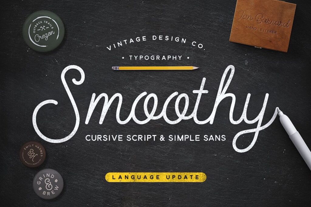
Smoothy is a 2 font family with a mono weight cursive script and a complementary subtly rounded sans-serif. Based on my most popular hand lettered style, give your work that stylish hand rendered look, with no effort. Works great applied to logos, prints, quotes, magazine headers, clothing… actually most applications!
4. Lavender Script
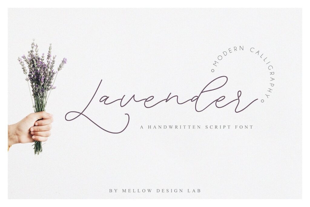
This style takes full advantage of flourishes and swooshes! It’s a versatile font that can be used in a relaxed setting just as well as it can appear on invitations and other formal uses. The letterforms are nicely spaced and have a slight tilt to the right.
5. Style Script
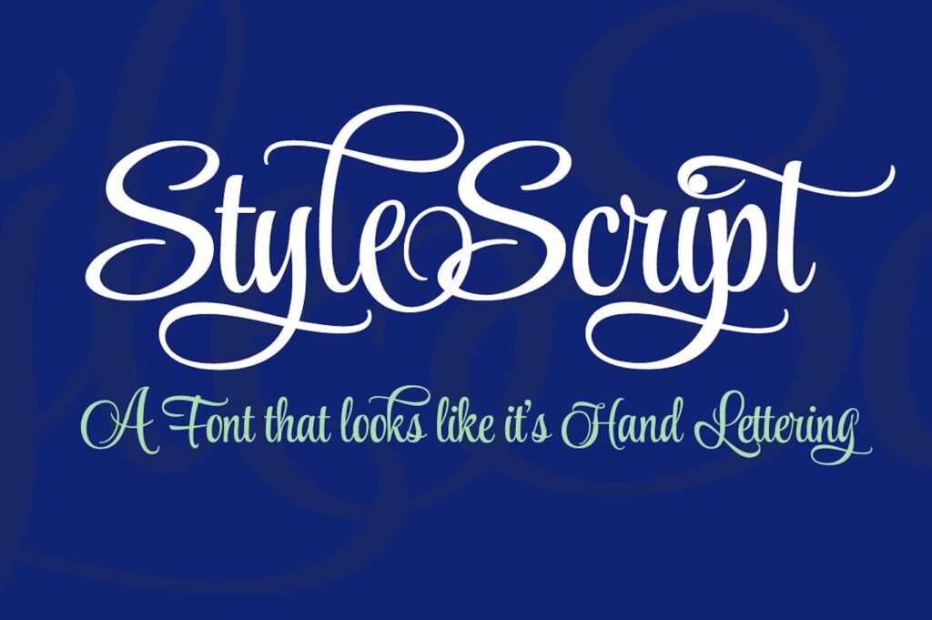
This font manages to transform a retro-looking script from the mid-twentieth century into a modern and stylish cursive font. Its upright letterforms give it a look that makes it stand out against many other script font offerings.
Final Thoughts About Cursive Lettering
I hope this post has been able to shed some light on lettering cursive as well as the differences between cursive and other lettering styles for you! If you never learned cursive in school, I highly recommend giving it a try. It’s a skill that has benefits that will help you improve your other lettering skills.
Whether you are writing cursive letters by hand or using script fonts, cursive lettering will add style and character to your projects. Happy lettering!
Most Posts To Read
- Hand Lettering Capital Letters: How To Make Different Styles
- Alexa, Do The Dishes: Quick And Easy Hand Lettering Trick
- Hand Lettering Capital Letters: How To Make Different Styles
- Best Hand Lettering Books: 15 Must-Haves For Your Library
- Hand Lettering Alphabet Practice 101: Tips And Resources For Improving Your Skills